Panotour - Style - Plugins library - Control bar
Contents
- 1 Classic Control Bar
- 1.1 Multiple Instances: Yes
- 1.2 Position
- 1.3 Display
- 1.4 Available Controls
- 1.4.1 Play Pause a Panoramic Video
- 1.4.2 Previous/Next Panorama
- 1.4.3 Zoom
- 1.4.4 Move Horizontally
- 1.4.5 Move Vertically
- 1.4.6 Home
- 1.4.7 Fullscreen
- 1.4.8 Start/Stop Autorotation
- 1.4.9 Start/Stop Automatic Tour
- 1.4.10 Start/Stop Sounds
- 1.4.11 Show/Hide Hotspots
- 1.4.12 Show/Hide Thumbnails
- 1.4.13 Enable/Disable Gyroscope
- 1.4.14 Show/Hide Floor Plan
- 1.4.15 Show/Hide Map
- 1.4.16 Share the Tour
- 1.4.17 Show/Hide Help Screen
- 1.4.18 Show/Hide Information
- 1.4.19 Enter VR Mode
- 1.4.20 Show/Hide Controls
- 1.4.21 Change Mouse Navigation Mode
- 1.5 Tooltips Style
- 1.6 Behavior
- 2 D-Pad Control Bar
- 2.1 Multiple Instances: No
- 2.2 Position
- 2.3 Display
- 2.4 Available Controls
- 2.4.1 Play Pause a Panoramic Video
- 2.4.2 Previous/Next Panorama
- 2.4.3 Zoom
- 2.4.4 Move Horizontally
- 2.4.5 Move Vertically
- 2.4.6 Home
- 2.4.7 Fullscreen
- 2.4.8 Start/Stop Autorotation
- 2.4.9 Start/Stop Automatic Tour
- 2.4.10 Start/Stop Sounds
- 2.4.11 Show/Hide Hotspots
- 2.4.12 Show/Hide Thumbnails
- 2.4.13 Enable/Disable Gyroscope
- 2.4.14 Show/Hide Floor Plan
- 2.4.15 Show/Hide Map
- 2.4.16 Share the Tour
- 2.4.17 Show/Hide Help Screen
- 2.4.18 Show/Hide Information
- 2.4.19 Enter VR Mode
- 2.4.20 Show/Hide Controls
- 2.4.21 Change Mouse Navigation Mode
- 2.5 Tooltips Style
- 2.6 Behavior
- 3 Docked Thumbnails and Control Bar
- 3.1 Multiple Instances: No
- 3.2 Display
- 3.3 Thumbnails
- 3.4 Available Controls
- 3.4.1 Play Pause a Panoramic Video
- 3.4.2 Previous/Next Panorama
- 3.4.3 Zoom
- 3.4.4 Move Horizontally
- 3.4.5 Move Vertically
- 3.4.6 Home
- 3.4.7 Fullscreen
- 3.4.8 Start/Stop Autorotation
- 3.4.9 Start/Stop Automatic Tour
- 3.4.10 Start/Stop Sounds
- 3.4.11 Show/Hide Hotspots
- 3.4.12 Show/Hide Thumbnails
- 3.4.13 Enable/Disable Gyroscope
- 3.4.14 Show/Hide Floor Plan
- 3.4.15 Show/Hide Map
- 3.4.16 Share the Tour
- 3.4.17 Show/Hide Help Screen
- 3.4.18 Show/Hide Information
- 3.4.19 Enter VR Mode
- 3.4.20 Show/Hide Controls
- 3.4.21 Change Mouse Navigation Mode
- 3.5 Tooltips Style
- 3.6 Behavior
- 3.7 Skins
- 4 Rounded Control Bar
- 4.1 Multiple Instances: No
- 4.2 Display
- 4.3 Available Controls
- 4.3.1 Play Pause a Panoramic Video
- 4.3.2 Previous/Next Panorama
- 4.3.3 Zoom
- 4.3.4 Move Horizontally
- 4.3.5 Move Vertically
- 4.3.6 Home
- 4.3.7 Fullscreen
- 4.3.8 Start/Stop Autorotation
- 4.3.9 Start/Stop Automatic Tour
- 4.3.10 Start/Stop Sounds
- 4.3.11 Show/Hide Hotspots
- 4.3.12 Show/Hide Thumbnails
- 4.3.13 Enable/Disable Gyroscope
- 4.3.14 Show/Hide Floor Plan
- 4.3.15 Show/Hide Map
- 4.3.16 Share the Tour
- 4.3.17 Show/Hide Help Screen
- 4.3.18 Show/Hide Information
- 4.3.19 Enter VR Mode
- 4.3.20 Show/Hide Controls
- 4.3.21 Change Mouse Navigation Mode
- 4.4 Tooltips Style
- 4.5 Behavior
- 5 Urban Control Bar
- 5.1 Multiple Instances: Yes
- 5.2 Display
- 5.3 Available Controls
- 5.3.1 Play Pause a Panoramic Video
- 5.3.2 Previous/Next Panorama
- 5.3.3 Zoom
- 5.3.4 Move Horizontally
- 5.3.5 Move Vertically
- 5.3.6 Home
- 5.3.7 Fullscreen
- 5.3.8 Start/Stop Autorotation
- 5.3.9 Start/Stop Automatic Tour
- 5.3.10 Start/Stop Sounds
- 5.3.11 Show/Hide Hotspots
- 5.3.12 Show/Hide Thumbnails
- 5.3.13 Enable/Disable Gyroscope
- 5.3.14 Show/Hide Floor Plan
- 5.3.15 Show/Hide Map
- 5.3.16 Share the Tour
- 5.3.17 Show/Hide Help Screen
- 5.3.18 Show/Hide Information
- 5.3.19 Enter VR Mode
- 5.3.20 Show/Hide Controls
- 5.3.21 Change Mouse Navigation Mode
- 5.4 Tooltips Style
- 5.5 Behavior
- 6 iControl Bar
- 6.1 Multiple Instances: Yes
- 6.2 Display
- 6.3 Available Controls
- 6.3.1 Play Pause a Panoramic Video
- 6.3.2 Previous/Next Panorama
- 6.3.3 Zoom
- 6.3.4 Move Horizontally
- 6.3.5 Move Vertically
- 6.3.6 Home
- 6.3.7 Fullscreen
- 6.3.8 Start/Stop Autorotation
- 6.3.9 Start/Stop Automatic Tour
- 6.3.10 Start/Stop Sounds
- 6.3.11 Show/Hide Hotspots
- 6.3.12 Show/Hide Thumbnails
- 6.3.13 Enable/Disable Gyroscope
- 6.3.14 Show/Hide Floor Plan
- 6.3.15 Show/Hide Map
- 6.3.16 Share the Tour
- 6.3.17 Show/Hide Help Screen
- 6.3.18 Show/Hide Information
- 6.3.19 Enter VR Mode
- 6.3.20 Show/Hide Controls
- 6.3.21 Change Mouse Navigation Mode
- 6.4 Tooltips Style
- 6.5 Behavior
Classic Control Bar
 Watch on YouTube
Classic design control bar to browse your tour and interact with it.
 To add a plugin from the plugin library to your project, double click on it
Multiple Instances: Yes
This plugin can be added in multiple instances on your tour. However, it is recommended not to add too much plugin instances that may be obtrusive for your visitor.
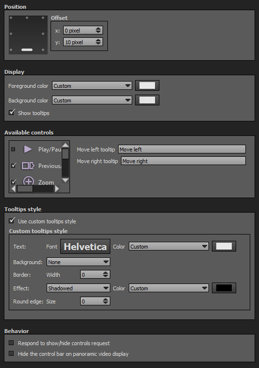
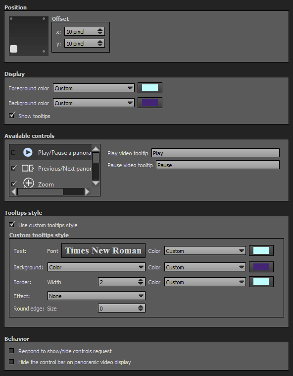
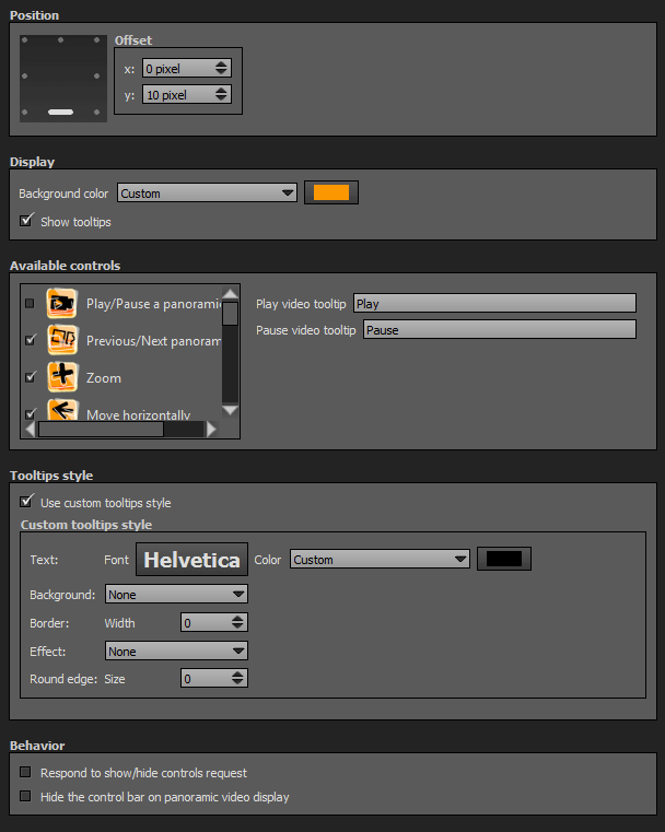
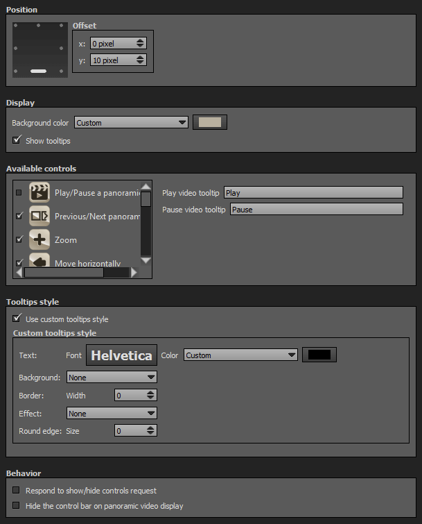
Position
- Square with dots: sets the position and alignment you wish on your tour for the plugin. Available positions are top left, top center, top right, middle right, bottom right, bottom center, bottom left, middle left. Available alignment are horizontal or vertical.
- Offset: Number of pixel between the plugin border of the viewport. x values adjust horizontal offset and y values adjust vertical offset.
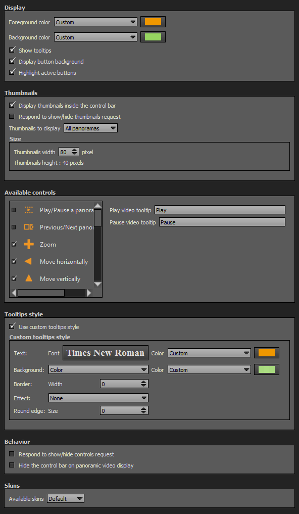
Display
- Foreground Color: You can select the plugin foreground color with the built-in color picker or select a project color in the dropdown menu. Project foreground color is defined in Project Properties > Color
- Background Color: You can select the plugin background color with the built-in color picker or select a project color in the dropdown menu. Project background color is defined in Project Properties > Color
- Show tooltips: Check to display tooltips on mouse hover.
Available Controls
In this box you can choose your control buttons and enter tooltips for each button.
Play Pause a Panoramic Video
Show/Hide the Play/Pause a panoramic video.
Previous/Next Panorama
Show/Hide Previous and Next picture/panorama buttons.
Zoom
Show/Hide Zoom in and Zoom out buttons.
Move Horizontally
Show/Hide Pan left and Pan right buttons.
Move Vertically
Show/Hide Pan up and Pan down right buttons.
Home
Show/Hide Home button. You can assign a click action for the Home button:
- Default view of current scene: Return to the default view of the current picture/panorama.
- Start scene of the tour: The scene the user saw first. It can be different of the first scene, if the user used a deep link to enter the tour.
- First scene of the tour: The first picture/panorama based on the order of the Project Properties > Order.
Fullscreen
Show/Hide Fullscreen button. Toggles Fullscreen on/off function.
Start/Stop Autorotation
Show/Hide Autorotation On/Off toggle button. Toggles start/stop Autorotation function.
Start/Stop Automatic Tour
Show/Hide Automatic Tour On/Off toggle button. Toggles start/stop Automatic Tour function.
Start/Stop Sounds
Show/Hide Sounds On/Mute toggle button. Toggles Sounds on/mute.
Show/Hide Hotspots
Show/Hide Hotspots toggle button. Toggles view/hide Hotspots.
Show/Hide Thumbnails
Show/Hide Thumbnails toggle button. Triggers opening/closing of the Thumbnails Plugin.
- This Show/Hide Thumbnails button sends a Show/Hide Thumbnails request.
- This button works only if Thumbnails Plugin is added in the Workspace.
Enable/Disable Gyroscope
Show/Hide Gyroscope On/Off button. Toggles enable/disable the gyroscope of the device playing the tour.
Show/Hide Floor Plan
Show/Hide Floor Plan toggle button. Triggers opening/closing of the Floor Plan Plugin.
- This Show/Hide Floor Plan button sends a Show/Hide Floor Plan request.
- This button works only if Floor Plan Plugin is added in the Workspace.
Show/Hide Map
Show/Hide Map toggle button. Triggers opening/closing of the PanotourMaps Plugin.
- This Show/Hide Map button sends a Show/Hide PanotourMaps request.
- This button works only if PanotourMaps Plugin is added in the Workspace.
Show/Hide Share button. Triggers opening/closing of the Social Share Plugin.
- This Show/Hide Share the Tour button sends a Show/Hide Share Box request.
- This button works only if Social Share Plugin is added in the Workspace.
Show/Hide Help Screen
Show/Hide Help Screen button. Triggers opening/closing of the Help Screen.
- An additional checkbox allows to select a different color for the help screen foreground.
Show/Hide Information
Show/Hide Information toggle button. Triggers opening/closing of the Description Plugin.
- This Show/Hide Information button sends a Show/Hide Information request.
- This button works only if Description Plugin is added in the Workspace.
Enter VR Mode
Show/Hide the button to enter VR Mode.
- Tours built with Panotour Pro 2.5+ are already VR Mode capable, all they need is a button to access it.
Show/Hide Controls
Show/Hide Controls toggle button. This button toggles show/hide components of the tour in which "Respond to show/hide controls request" behavior is checked.
Show/Hide Change Mouse Navigation Mode toggle button. This button toggles between "Drag to" mode to "Move to" mode.
Tooltips Style
In this area you can customize the default appearance of tooltips for your whole tour.
- Text Font: Click to open a window to customize font family, font size, font weight, font effect. Please see important notice about font style display.
- Text Color: You can select the font color and opacity with the built-in color picker.
- Background:
- None: No background color.
- Color: You can select the default tooltip background color with the built-in color picker.
- Border:
- Width: Enter the tooltip default width in pixels.
- Color: Select the default tooltip border color with the built-in color picker.
- Effect:
- None: No tooltip effect.
- Shadowed: Select the shadowed effect as default tooltip effect.
- Color: Select the default tooltip effect color with the built-in color picker.
Web Safe Font Families: Important Notice About Font Style
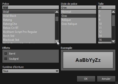
Please note that font you choose will may not display correctly on your users device. Font family you select has to be implemented on users computers/devices. Accordingly, prefer web safe font families like:
- Georgia, serif
- Palatino Linotype, Book Antiqua, Palatino, serif
- Times New Roman, Times, serif
- Arial, Helvetica, sans-serif (Recommended for readability and compatibility).
- Arial Black, Gadget, sans-serif
- Comic Sans MS, cursive, sans-serif
- Impact, Charcoal, sans-serif
- Lucida Sans Unicode, Lucida Grande, sans-serif
- Tahoma, Geneva, sans-serif
- Trebuchet MS, Helvetica, sans-serif
- Verdana, Geneva, sans-serif
- Courier New, Courier, monospace
- Lucida Console, Monaco, monospace
Behavior
- Respond to show/hide controls request: Checkbox to make the plugin reactive to a show/hide request action triggered from itself or another plugin.
- Hide the control bar on panoramic video display: If checked, this plugin automatically hides on a video scene.
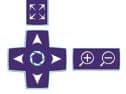
 D-Pad Control Bar
Watch on YouTube
Allows visitors to browse your tour and interact with it.
To add a plugin from the plugin library to your project, double click on it
Multiple Instances: No
Only one instance of this plugin can be added to your tour.
Position
- Square with dots: sets the position and alignment you wish on your tour for the plugin. Available positions are top left, top center, top right, middle right, bottom right, bottom center, bottom left, middle left. Available alignment are horizontal or vertical.
- Offset: Number of pixel between the plugin border of the viewport. x values adjust horizontal offset and y values adjust vertical offset.
Display
- Foreground Color: You can select the plugin foreground color with the built-in color picker or select a project color in the dropdown menu. Project foreground color is defined in Project Properties > Color
- Background Color: You can select the plugin background color with the built-in color picker or select a project color in the dropdown menu. Project background color is defined in Project Properties > Color
- Show tooltips: Check to display tooltips on mouse hover.
Available Controls
In this box you can choose your control buttons and enter tooltips for each button.
Play Pause a Panoramic Video
Show/Hide the Play/Pause a panoramic video.
Previous/Next Panorama
Show/Hide Previous and Next picture/panorama buttons.
Zoom
Show/Hide Zoom in and Zoom out buttons.
Move Horizontally
Show/Hide Pan left and Pan right buttons.
Move Vertically
Show/Hide Pan up and Pan down right buttons.
Home
Show/Hide Home button. You can assign a click action for the Home button:
- Default view of current scene: Return to the default view of the current picture/panorama.
- Start scene of the tour: The scene the user saw first. It can be different of the first scene, if the user used a deep link to enter the tour.
- First scene of the tour: The first picture/panorama based on the order of the Project Properties > Order.
Fullscreen
Show/Hide Fullscreen button. Toggles Fullscreen on/off function.
Start/Stop Autorotation
Show/Hide Autorotation On/Off toggle button. Toggles start/stop Autorotation function.
Start/Stop Automatic Tour
Show/Hide Automatic Tour On/Off toggle button. Toggles start/stop Automatic Tour function.
Start/Stop Sounds
Show/Hide Sounds On/Mute toggle button. Toggles Sounds on/mute.
Show/Hide Hotspots
Show/Hide Hotspots toggle button. Toggles view/hide Hotspots.
Show/Hide Thumbnails
Show/Hide Thumbnails toggle button. Triggers opening/closing of the Thumbnails Plugin.
- This Show/Hide Thumbnails button sends a Show/Hide Thumbnails request.
- This button works only if Thumbnails Plugin is added in the Workspace.
Enable/Disable Gyroscope
Show/Hide Gyroscope On/Off button. Toggles enable/disable the gyroscope of the device playing the tour.
Show/Hide Floor Plan
Show/Hide Floor Plan toggle button. Triggers opening/closing of the Floor Plan Plugin.
- This Show/Hide Floor Plan button sends a Show/Hide Floor Plan request.
- This button works only if Floor Plan Plugin is added in the Workspace.
Show/Hide Map
Show/Hide Map toggle button. Triggers opening/closing of the PanotourMaps Plugin.
- This Show/Hide Map button sends a Show/Hide PanotourMaps request.
- This button works only if PanotourMaps Plugin is added in the Workspace.
Show/Hide Share button. Triggers opening/closing of the Social Share Plugin.
- This Show/Hide Share the Tour button sends a Show/Hide Share Box request.
- This button works only if Social Share Plugin is added in the Workspace.
Show/Hide Help Screen
Show/Hide Help Screen button. Triggers opening/closing of the Help Screen.
- An additional checkbox allows to select a different color for the help screen foreground.
Show/Hide Information
Show/Hide Information toggle button. Triggers opening/closing of the Description Plugin.
- This Show/Hide Information button sends a Show/Hide Information request.
- This button works only if Description Plugin is added in the Workspace.
Enter VR Mode
Show/Hide the button to enter VR Mode.
- Tours built with Panotour Pro 2.5+ are already VR Mode capable, all they need is a button to access it.
Show/Hide Controls
Show/Hide Controls toggle button. This button toggles show/hide components of the tour in which "Respond to show/hide controls request" behavior is checked.
Show/Hide Change Mouse Navigation Mode toggle button. This button toggles between "Drag to" mode to "Move to" mode.
Tooltips Style
In this area you can customize the default appearance of tooltips for your whole tour.
- Text Font: Click to open a window to customize font family, font size, font weight, font effect. Please see important notice about font style display.
- Text Color: You can select the font color and opacity with the built-in color picker.
- Background:
- None: No background color.
- Color: You can select the default tooltip background color with the built-in color picker.
- Border:
- Width: Enter the tooltip default width in pixels.
- Color: Select the default tooltip border color with the built-in color picker.
- Effect:
- None: No tooltip effect.
- Shadowed: Select the shadowed effect as default tooltip effect.
- Color: Select the default tooltip effect color with the built-in color picker.
Web Safe Font Families: Important Notice About Font Style
Please note that font you choose will may not display correctly on your users device. Font family you select has to be implemented on users computers/devices. Accordingly, prefer web safe font families like:
- Georgia, serif
- Palatino Linotype, Book Antiqua, Palatino, serif
- Times New Roman, Times, serif
- Arial, Helvetica, sans-serif (Recommended for readability and compatibility).
- Arial Black, Gadget, sans-serif
- Comic Sans MS, cursive, sans-serif
- Impact, Charcoal, sans-serif
- Lucida Sans Unicode, Lucida Grande, sans-serif
- Tahoma, Geneva, sans-serif
- Trebuchet MS, Helvetica, sans-serif
- Verdana, Geneva, sans-serif
- Courier New, Courier, monospace
- Lucida Console, Monaco, monospace
Behavior
- Respond to show/hide controls request: Checkbox to make the plugin reactive to a show/hide request action triggered from itself or another plugin.
- Hide the control bar on panoramic video display: If checked, this plugin automatically hides on a video scene.
Docked Thumbnails and Control Bar
Watch on YouTube
Allows visitors to browse your tour and interact with it.
To add a plugin from the plugin library to your project, double click on it
Multiple Instances: No
Only one instance of this plugin can be added to your tour.
Display
- Foreground Color: You can select the plugin foreground color with the built-in color picker or select a project color in the dropdown menu. Project foreground color is defined in Project Properties > Color
- Background Color: You can select the plugin background color with the built-in color picker or select a project color in the dropdown menu. Project background color is defined in Project Properties > Color
- Show tooltips: Check to display tooltips on mouse hover.
- Display button background: Show/Hide button circle background.
- Highlight active buttons: Maintains hover color when button function is activated.
Thumbnails
- Display thumbnails inside the control bar: Checkbox to show/Hide thumbnails in the control bar.
- Display Panorama or Group Name in a title over the thumbnail: Checkbox to display or not the name of the target scene in a permanent title over the thumbnail.
- Respond to show/hide thumbnail request: Checkbox to make the plugin reactive to a show/hide thumbnail request action triggered from itself or another plugin.
- Thumbnails to display: Dropdown menu to select which pictures you wish to display.
- All panoramas: Displays all scenes included into your project.
- All groups: Displays the first scene of every group of your project.
- Current group: Displays scenes of the current group.
Available Controls
In this box you can choose your control buttons and enter tooltips for each button.
Play Pause a Panoramic Video
Show/Hide the Play/Pause a panoramic video.
Previous/Next Panorama
Show/Hide Previous and Next picture/panorama buttons.
Zoom
Show/Hide Zoom in and Zoom out buttons.
Move Horizontally
Show/Hide Pan left and Pan right buttons.
Move Vertically
Show/Hide Pan up and Pan down right buttons.
Home
Show/Hide Home button. You can assign a click action for the Home button:
- Default view of current scene: Return to the default view of the current picture/panorama.
- Start scene of the tour: The scene the user saw first. It can be different of the first scene, if the user used a deep link to enter the tour.
- First scene of the tour: The first picture/panorama based on the order of the Project Properties > Order.
Fullscreen
Show/Hide Fullscreen button. Toggles Fullscreen on/off function.
Start/Stop Autorotation
Show/Hide Autorotation On/Off toggle button. Toggles start/stop Autorotation function.
Start/Stop Automatic Tour
Show/Hide Automatic Tour On/Off toggle button. Toggles start/stop Automatic Tour function.
Start/Stop Sounds
Show/Hide Sounds On/Mute toggle button. Toggles Sounds on/mute.
Show/Hide Hotspots
Show/Hide Hotspots toggle button. Toggles view/hide Hotspots.
Show/Hide Thumbnails
Show/Hide Thumbnails toggle button. Triggers opening/closing of the Thumbnails Plugin.
- This Show/Hide Thumbnails button sends a Show/Hide Thumbnails request.
- This button works only if Thumbnails Plugin is added in the Workspace.
Enable/Disable Gyroscope
Show/Hide Gyroscope On/Off button. Toggles enable/disable the gyroscope of the device playing the tour.
Show/Hide Floor Plan
Show/Hide Floor Plan toggle button. Triggers opening/closing of the Floor Plan Plugin.
- This Show/Hide Floor Plan button sends a Show/Hide Floor Plan request.
- This button works only if Floor Plan Plugin is added in the Workspace.
Show/Hide Map
Show/Hide Map toggle button. Triggers opening/closing of the PanotourMaps Plugin.
- This Show/Hide Map button sends a Show/Hide PanotourMaps request.
- This button works only if PanotourMaps Plugin is added in the Workspace.
Show/Hide Share button. Triggers opening/closing of the Social Share Plugin.
- This Show/Hide Share the Tour button sends a Show/Hide Share Box request.
- This button works only if Social Share Plugin is added in the Workspace.
Show/Hide Help Screen
Show/Hide Help Screen button. Triggers opening/closing of the Help Screen.
- An additional checkbox allows to select a different color for the help screen foreground.
Show/Hide Information
Show/Hide Information toggle button. Triggers opening/closing of the Description Plugin.
- This Show/Hide Information button sends a Show/Hide Information request.
- This button works only if Description Plugin is added in the Workspace.
Enter VR Mode
Show/Hide the button to enter VR Mode.
- Tours built with Panotour Pro 2.5+ are already VR Mode capable, all they need is a button to access it.
Show/Hide Controls
Show/Hide Controls toggle button. This button toggles show/hide components of the tour in which "Respond to show/hide controls request" behavior is checked.
Show/Hide Change Mouse Navigation Mode toggle button. This button toggles between "Drag to" mode to "Move to" mode.
Tooltips Style
In this area you can customize the default appearance of tooltips for your whole tour.
- Text Font: Click to open a window to customize font family, font size, font weight, font effect. Please see important notice about font style display.
- Text Color: You can select the font color and opacity with the built-in color picker.
- Background:
- None: No background color.
- Color: You can select the default tooltip background color with the built-in color picker.
- Border:
- Width: Enter the tooltip default width in pixels.
- Color: Select the default tooltip border color with the built-in color picker.
- Effect:
- None: No tooltip effect.
- Shadowed: Select the shadowed effect as default tooltip effect.
- Color: Select the default tooltip effect color with the built-in color picker.
Web Safe Font Families: Important Notice About Font Style
Please note that font you choose will may not display correctly on your users device. Font family you select has to be implemented on users computers/devices. Accordingly, prefer web safe font families like:
- Georgia, serif
- Palatino Linotype, Book Antiqua, Palatino, serif
- Times New Roman, Times, serif
- Arial, Helvetica, sans-serif (Recommended for readability and compatibility).
- Arial Black, Gadget, sans-serif
- Comic Sans MS, cursive, sans-serif
- Impact, Charcoal, sans-serif
- Lucida Sans Unicode, Lucida Grande, sans-serif
- Tahoma, Geneva, sans-serif
- Trebuchet MS, Helvetica, sans-serif
- Verdana, Geneva, sans-serif
- Courier New, Courier, monospace
- Lucida Console, Monaco, monospace
Behavior
- Respond to show/hide controls request: Checkbox to make the plugin reactive to a show/hide request action triggered from itself or another plugin.
- Hide the control bar on panoramic video display: If checked, this plugin automatically hides on a video scene.
Skins
With the dropdown menu, you can select a skin to change the plugin color style.
Rounded Control Bar

Watch on YouTube
Rounded style that allows visitors to browse your tour and interact with it.
To add a plugin from the plugin library to your project, double click on it
Multiple Instances: No
Only one instance of this plugin can be added to your tour.
Display
- Foreground Color: You can select the plugin foreground color with the built-in color picker or select a project color in the dropdown menu. Project foreground color is defined in Project Properties > Color
- Show tooltips: Check to display tooltips on mouse hover.
Available Controls
In this box you can choose your control buttons and enter tooltips for each button.
Play Pause a Panoramic Video
Show/Hide the Play/Pause a panoramic video.
Previous/Next Panorama
Show/Hide Previous and Next picture/panorama buttons.
Zoom
Show/Hide Zoom in and Zoom out buttons.
Move Horizontally
Show/Hide Pan left and Pan right buttons.
Move Vertically
Show/Hide Pan up and Pan down right buttons.
Home
Show/Hide Home button. You can assign a click action for the Home button:
- Default view of current scene: Return to the default view of the current picture/panorama.
- Start scene of the tour: The scene the user saw first. It can be different of the first scene, if the user used a deep link to enter the tour.
- First scene of the tour: The first picture/panorama based on the order of the Project Properties > Order.
Fullscreen
Show/Hide Fullscreen button. Toggles Fullscreen on/off function.
Start/Stop Autorotation
Show/Hide Autorotation On/Off toggle button. Toggles start/stop Autorotation function.
Start/Stop Automatic Tour
Show/Hide Automatic Tour On/Off toggle button. Toggles start/stop Automatic Tour function.
Start/Stop Sounds
Show/Hide Sounds On/Mute toggle button. Toggles Sounds on/mute.
Show/Hide Hotspots
Show/Hide Hotspots toggle button. Toggles view/hide Hotspots.
Show/Hide Thumbnails
Show/Hide Thumbnails toggle button. Triggers opening/closing of the Thumbnails Plugin.
- This Show/Hide Thumbnails button sends a Show/Hide Thumbnails request.
- This button works only if Thumbnails Plugin is added in the Workspace.
Enable/Disable Gyroscope
Show/Hide Gyroscope On/Off button. Toggles enable/disable the gyroscope of the device playing the tour.
Show/Hide Floor Plan
Show/Hide Floor Plan toggle button. Triggers opening/closing of the Floor Plan Plugin.
- This Show/Hide Floor Plan button sends a Show/Hide Floor Plan request.
- This button works only if Floor Plan Plugin is added in the Workspace.
Show/Hide Map
Show/Hide Map toggle button. Triggers opening/closing of the PanotourMaps Plugin.
- This Show/Hide Map button sends a Show/Hide PanotourMaps request.
- This button works only if PanotourMaps Plugin is added in the Workspace.
Show/Hide Share button. Triggers opening/closing of the Social Share Plugin.
- This Show/Hide Share the Tour button sends a Show/Hide Share Box request.
- This button works only if Social Share Plugin is added in the Workspace.
Show/Hide Help Screen
Show/Hide Help Screen button. Triggers opening/closing of the Help Screen.
- An additional checkbox allows to select a different color for the help screen foreground.
Show/Hide Information
Show/Hide Information toggle button. Triggers opening/closing of the Description Plugin.
- This Show/Hide Information button sends a Show/Hide Information request.
- This button works only if Description Plugin is added in the Workspace.
Enter VR Mode
Show/Hide the button to enter VR Mode.
- Tours built with Panotour Pro 2.5+ are already VR Mode capable, all they need is a button to access it.
Show/Hide Controls
Show/Hide Controls toggle button. This button toggles show/hide components of the tour in which "Respond to show/hide controls request" behavior is checked.
Show/Hide Change Mouse Navigation Mode toggle button. This button toggles between "Drag to" mode to "Move to" mode.
Tooltips Style
In this area you can customize the default appearance of tooltips for your whole tour.
- Text Font: Click to open a window to customize font family, font size, font weight, font effect. Please see important notice about font style display.
- Text Color: You can select the font color and opacity with the built-in color picker.
- Background:
- None: No background color.
- Color: You can select the default tooltip background color with the built-in color picker.
- Border:
- Width: Enter the tooltip default width in pixels.
- Color: Select the default tooltip border color with the built-in color picker.
- Effect:
- None: No tooltip effect.
- Shadowed: Select the shadowed effect as default tooltip effect.
- Color: Select the default tooltip effect color with the built-in color picker.
Web Safe Font Families: Important Notice About Font Style
Please note that font you choose will may not display correctly on your users device. Font family you select has to be implemented on users computers/devices. Accordingly, prefer web safe font families like:
- Georgia, serif
- Palatino Linotype, Book Antiqua, Palatino, serif
- Times New Roman, Times, serif
- Arial, Helvetica, sans-serif (Recommended for readability and compatibility).
- Arial Black, Gadget, sans-serif
- Comic Sans MS, cursive, sans-serif
- Impact, Charcoal, sans-serif
- Lucida Sans Unicode, Lucida Grande, sans-serif
- Tahoma, Geneva, sans-serif
- Trebuchet MS, Helvetica, sans-serif
- Verdana, Geneva, sans-serif
- Courier New, Courier, monospace
- Lucida Console, Monaco, monospace
Behavior
- Respond to show/hide controls request: Checkbox to make the plugin reactive to a show/hide request action triggered from itself or another plugin.
- Hide the control bar on panoramic video display: If checked, this plugin automatically hides on a video scene.
Urban Control Bar
Watch on YouTube
Allows visitors to browse your tour and interact with it.
To add a plugin from the plugin library to your project, double click on it
Multiple Instances: Yes
This plugin can be added in multiple instances on your tour. However, it is recommended not to add too much plugin instances that may be obtrusive for your visitor.
Display
- Background Color: You can select the plugin background color with the built-in color picker or select a project color in the dropdown menu. Project background color is defined in Project Properties > Color
- Show tooltips: Check to display tooltips on mouse hover.
Available Controls
In this box you can choose your control buttons and enter tooltips for each button.
Play Pause a Panoramic Video
Show/Hide the Play/Pause a panoramic video.
Previous/Next Panorama
Show/Hide Previous and Next picture/panorama buttons.
Zoom
Show/Hide Zoom in and Zoom out buttons.
Move Horizontally
Show/Hide Pan left and Pan right buttons.
Move Vertically
Show/Hide Pan up and Pan down right buttons.
Home
Show/Hide Home button. You can assign a click action for the Home button:
- Default view of current scene: Return to the default view of the current picture/panorama.
- Start scene of the tour: The scene the user saw first. It can be different of the first scene, if the user used a deep link to enter the tour.
- First scene of the tour: The first picture/panorama based on the order of the Project Properties > Order.
Fullscreen
Show/Hide Fullscreen button. Toggles Fullscreen on/off function.
Start/Stop Autorotation
Show/Hide Autorotation On/Off toggle button. Toggles start/stop Autorotation function.
Start/Stop Automatic Tour
Show/Hide Automatic Tour On/Off toggle button. Toggles start/stop Automatic Tour function.
Start/Stop Sounds
Show/Hide Sounds On/Mute toggle button. Toggles Sounds on/mute.
Show/Hide Hotspots
Show/Hide Hotspots toggle button. Toggles view/hide Hotspots.
Show/Hide Thumbnails
Show/Hide Thumbnails toggle button. Triggers opening/closing of the Thumbnails Plugin.
- This Show/Hide Thumbnails button sends a Show/Hide Thumbnails request.
- This button works only if Thumbnails Plugin is added in the Workspace.
Enable/Disable Gyroscope
Show/Hide Gyroscope On/Off button. Toggles enable/disable the gyroscope of the device playing the tour.
Show/Hide Floor Plan
Show/Hide Floor Plan toggle button. Triggers opening/closing of the Floor Plan Plugin.
- This Show/Hide Floor Plan button sends a Show/Hide Floor Plan request.
- This button works only if Floor Plan Plugin is added in the Workspace.
Show/Hide Map
Show/Hide Map toggle button. Triggers opening/closing of the PanotourMaps Plugin.
- This Show/Hide Map button sends a Show/Hide PanotourMaps request.
- This button works only if PanotourMaps Plugin is added in the Workspace.
Show/Hide Share button. Triggers opening/closing of the Social Share Plugin.
- This Show/Hide Share the Tour button sends a Show/Hide Share Box request.
- This button works only if Social Share Plugin is added in the Workspace.
Show/Hide Help Screen
Show/Hide Help Screen button. Triggers opening/closing of the Help Screen.
- An additional checkbox allows to select a different color for the help screen foreground.
Show/Hide Information
Show/Hide Information toggle button. Triggers opening/closing of the Description Plugin.
- This Show/Hide Information button sends a Show/Hide Information request.
- This button works only if Description Plugin is added in the Workspace.
Enter VR Mode
Show/Hide the button to enter VR Mode.
- Tours built with Panotour Pro 2.5+ are already VR Mode capable, all they need is a button to access it.
Show/Hide Controls
Show/Hide Controls toggle button. This button toggles show/hide components of the tour in which "Respond to show/hide controls request" behavior is checked.
Show/Hide Change Mouse Navigation Mode toggle button. This button toggles between "Drag to" mode to "Move to" mode.
Tooltips Style
In this area you can customize the default appearance of tooltips for your whole tour.
- Text Font: Click to open a window to customize font family, font size, font weight, font effect. Please see important notice about font style display.
- Text Color: You can select the font color and opacity with the built-in color picker.
- Background:
- None: No background color.
- Color: You can select the default tooltip background color with the built-in color picker.
- Border:
- Width: Enter the tooltip default width in pixels.
- Color: Select the default tooltip border color with the built-in color picker.
- Effect:
- None: No tooltip effect.
- Shadowed: Select the shadowed effect as default tooltip effect.
- Color: Select the default tooltip effect color with the built-in color picker.
Web Safe Font Families: Important Notice About Font Style
Please note that font you choose will may not display correctly on your users device. Font family you select has to be implemented on users computers/devices. Accordingly, prefer web safe font families like:
- Georgia, serif
- Palatino Linotype, Book Antiqua, Palatino, serif
- Times New Roman, Times, serif
- Arial, Helvetica, sans-serif (Recommended for readability and compatibility).
- Arial Black, Gadget, sans-serif
- Comic Sans MS, cursive, sans-serif
- Impact, Charcoal, sans-serif
- Lucida Sans Unicode, Lucida Grande, sans-serif
- Tahoma, Geneva, sans-serif
- Trebuchet MS, Helvetica, sans-serif
- Verdana, Geneva, sans-serif
- Courier New, Courier, monospace
- Lucida Console, Monaco, monospace
Behavior
- Respond to show/hide controls request: Checkbox to make the plugin reactive to a show/hide request action triggered from itself or another plugin.
- Hide the control bar on panoramic video display: If checked, this plugin automatically hides on a video scene.
iControl Bar
Watch on YouTube
Allows visitors to browse your tour and interact with it.
To add a plugin from the plugin library to your project, double click on it
Multiple Instances: Yes
This plugin can be added in multiple instances on your tour. However, it is recommended not to add too much plugin instances that may be obtrusive for your visitor.
Display
- Background Color: You can select the plugin background color with the built-in color picker or select a project color in the dropdown menu. Project background color is defined in Project Properties > Color
- Show tooltips: Check to display tooltips on mouse hover.
Available Controls
In this box you can choose your control buttons and enter tooltips for each button.
Play Pause a Panoramic Video
Show/Hide the Play/Pause a panoramic video.
Previous/Next Panorama
Show/Hide Previous and Next picture/panorama buttons.
Zoom
Show/Hide Zoom in and Zoom out buttons.
Move Horizontally
Show/Hide Pan left and Pan right buttons.
Move Vertically
Show/Hide Pan up and Pan down right buttons.
Home
Show/Hide Home button. You can assign a click action for the Home button:
- Default view of current scene: Return to the default view of the current picture/panorama.
- Start scene of the tour: The scene the user saw first. It can be different of the first scene, if the user used a deep link to enter the tour.
- First scene of the tour: The first picture/panorama based on the order of the Project Properties > Order.
Fullscreen
Show/Hide Fullscreen button. Toggles Fullscreen on/off function.
Start/Stop Autorotation
Show/Hide Autorotation On/Off toggle button. Toggles start/stop Autorotation function.
Start/Stop Automatic Tour
Show/Hide Automatic Tour On/Off toggle button. Toggles start/stop Automatic Tour function.
Start/Stop Sounds
Show/Hide Sounds On/Mute toggle button. Toggles Sounds on/mute.
Show/Hide Hotspots
Show/Hide Hotspots toggle button. Toggles view/hide Hotspots.
Show/Hide Thumbnails
Show/Hide Thumbnails toggle button. Triggers opening/closing of the Thumbnails Plugin.
- This Show/Hide Thumbnails button sends a Show/Hide Thumbnails request.
- This button works only if Thumbnails Plugin is added in the Workspace.
Enable/Disable Gyroscope
Show/Hide Gyroscope On/Off button. Toggles enable/disable the gyroscope of the device playing the tour.
Show/Hide Floor Plan
Show/Hide Floor Plan toggle button. Triggers opening/closing of the Floor Plan Plugin.
- This Show/Hide Floor Plan button sends a Show/Hide Floor Plan request.
- This button works only if Floor Plan Plugin is added in the Workspace.
Show/Hide Map
Show/Hide Map toggle button. Triggers opening/closing of the PanotourMaps Plugin.
- This Show/Hide Map button sends a Show/Hide PanotourMaps request.
- This button works only if PanotourMaps Plugin is added in the Workspace.
Show/Hide Share button. Triggers opening/closing of the Social Share Plugin.
- This Show/Hide Share the Tour button sends a Show/Hide Share Box request.
- This button works only if Social Share Plugin is added in the Workspace.
Show/Hide Help Screen
Show/Hide Help Screen button. Triggers opening/closing of the Help Screen.
- An additional checkbox allows to select a different color for the help screen foreground.
Show/Hide Information
Show/Hide Information toggle button. Triggers opening/closing of the Description Plugin.
- This Show/Hide Information button sends a Show/Hide Information request.
- This button works only if Description Plugin is added in the Workspace.
Enter VR Mode
Show/Hide the button to enter VR Mode.
- Tours built with Panotour Pro 2.5+ are already VR Mode capable, all they need is a button to access it.
Show/Hide Controls
Show/Hide Controls toggle button. This button toggles show/hide components of the tour in which "Respond to show/hide controls request" behavior is checked.
Show/Hide Change Mouse Navigation Mode toggle button. This button toggles between "Drag to" mode to "Move to" mode.
Tooltips Style
In this area you can customize the default appearance of tooltips for your whole tour.
- Text Font: Click to open a window to customize font family, font size, font weight, font effect. Please see important notice about font style display.
- Text Color: You can select the font color and opacity with the built-in color picker.
- Background:
- None: No background color.
- Color: You can select the default tooltip background color with the built-in color picker.
- Border:
- Width: Enter the tooltip default width in pixels.
- Color: Select the default tooltip border color with the built-in color picker.
- Effect:
- None: No tooltip effect.
- Shadowed: Select the shadowed effect as default tooltip effect.
- Color: Select the default tooltip effect color with the built-in color picker.
Web Safe Font Families: Important Notice About Font Style
Please note that font you choose will may not display correctly on your users device. Font family you select has to be implemented on users computers/devices. Accordingly, prefer web safe font families like:
- Georgia, serif
- Palatino Linotype, Book Antiqua, Palatino, serif
- Times New Roman, Times, serif
- Arial, Helvetica, sans-serif (Recommended for readability and compatibility).
- Arial Black, Gadget, sans-serif
- Comic Sans MS, cursive, sans-serif
- Impact, Charcoal, sans-serif
- Lucida Sans Unicode, Lucida Grande, sans-serif
- Tahoma, Geneva, sans-serif
- Trebuchet MS, Helvetica, sans-serif
- Verdana, Geneva, sans-serif
- Courier New, Courier, monospace
- Lucida Console, Monaco, monospace
Behavior
- Respond to show/hide controls request: Checkbox to make the plugin reactive to a show/hide request action triggered from itself or another plugin.
- Hide the control bar on panoramic video display: If checked, this plugin automatically hides on a video scene.
BACK TO: Documentation / Panotour Documentation