Panotour - Style - Plugins library - Controls
Contents
 Previous Next Dots
 Watch on YouTube
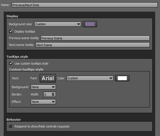
Side dots that allow user to browse between panoramas.
 To add a plugin from the plugin library to your project, double click on it
Multiple Instances: No
Only one instance of this plugin can be added to your tour.
Display
- Background Color: You can select the plugin background color with the built-in color picker or select a project color in the dropdown menu. Project background color is defined in Project Properties > Color
- Display tooltips: Check to display tooltips on mouse hover.
- Previous scene tooltips: Enter text you wish to display when user hovers the previous button.
- Next scene tooltips: Enter text you wish to display when user hovers the next button.
Tooltips Style
In this area you can customize the default appearance of tooltips for your whole tour.
- Text Font: Click to open a window to customize font family, font size, font weight, font effect. Please see important notice about font style display.
- Text Color: You can select the font color and opacity with the built-in color picker.
- Background:
- None: No background color.
- Color: You can select the default tooltip background color with the built-in color picker.
- Border:
- Width: Enter the tooltip default width in pixels.
- Color: Select the default tooltip border color with the built-in color picker.
- Effect:
- None: No tooltip effect.
- Shadowed: Select the shadowed effect as default tooltip effect.
- Color: Select the default tooltip effect color with the built-in color picker.
Web Safe Font Families: Important Notice About Font Style
Please note that font you choose will may not display correctly on your users device. Font family you select has to be implemented on users computers/devices. Accordingly, prefer web safe font families like:
- Georgia, serif
- Palatino Linotype, Book Antiqua, Palatino, serif
- Times New Roman, Times, serif
- Arial, Helvetica, sans-serif (Recommended for readability and compatibility).
- Arial Black, Gadget, sans-serif
- Comic Sans MS, cursive, sans-serif
- Impact, Charcoal, sans-serif
- Lucida Sans Unicode, Lucida Grande, sans-serif
- Tahoma, Geneva, sans-serif
- Trebuchet MS, Helvetica, sans-serif
- Verdana, Geneva, sans-serif
- Courier New, Courier, monospace
- Lucida Console, Monaco, monospace
Behavior
Respond to show/hide controls request: Checkbox to make the plugin reactive to a show/hide request action triggered from itself or another plugin.
Previous Next Strips
Side strips that allow user to browse between panoramas.
To add a plugin from the plugin library to your project, double click on it
Multiple Instances: No
Only one instance of this plugin can be added to your tour.
Display
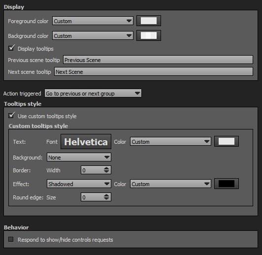
- Foreground Color: You can select the plugin foreground color with the built-in color picker or select a project color in the dropdown menu. Project foreground color is defined in Project Properties > Color
- Background Color: You can select the plugin background color with the built-in color picker or select a project color in the dropdown menu. Project background color is defined in Project Properties > Color
- Display tooltips: Check to display tooltips on mouse hover.
- Previous scene tooltips: Enter text you wish to display when user hovers the previous button.
- Next scene tooltips: Enter text you wish to display when user hovers the next button.
Action Triggered
Select which action to apply when the user clicks on a strip.
- Go to Previous or Next Panorama
- Go to Previous or Next Group
Tooltips Style
In this area you can customize the default appearance of tooltips for your whole tour.
- Text Font: Click to open a window to customize font family, font size, font weight, font effect. Please see important notice about font style display.
- Text Color: You can select the font color and opacity with the built-in color picker.
- Background:
- None: No background color.
- Color: You can select the default tooltip background color with the built-in color picker.
- Border:
- Width: Enter the tooltip default width in pixels.
- Color: Select the default tooltip border color with the built-in color picker.
- Effect:
- None: No tooltip effect.
- Shadowed: Select the shadowed effect as default tooltip effect.
- Color: Select the default tooltip effect color with the built-in color picker.
Web Safe Font Families: Important Notice About Font Style
Please note that font you choose will may not display correctly on your users device. Font family you select has to be implemented on users computers/devices. Accordingly, prefer web safe font families like:
- Georgia, serif
- Palatino Linotype, Book Antiqua, Palatino, serif
- Times New Roman, Times, serif
- Arial, Helvetica, sans-serif (Recommended for readability and compatibility).
- Arial Black, Gadget, sans-serif
- Comic Sans MS, cursive, sans-serif
- Impact, Charcoal, sans-serif
- Lucida Sans Unicode, Lucida Grande, sans-serif
- Tahoma, Geneva, sans-serif
- Trebuchet MS, Helvetica, sans-serif
- Verdana, Geneva, sans-serif
- Courier New, Courier, monospace
- Lucida Console, Monaco, monospace
Behavior
Respond to show/hide controls request: Checkbox to make the plugin reactive to a show/hide request action triggered from itself or another plugin.
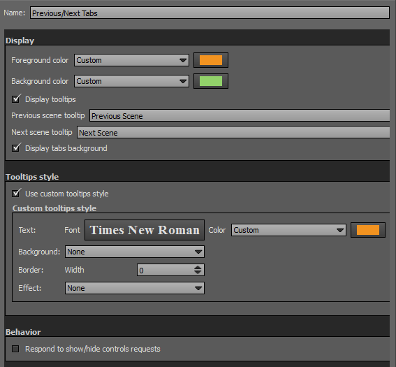
Previous Next Tabs

Watch on YouTube Side tabs that allow user to browse between panoramas.
To add a plugin from the plugin library to your project, double click on it
Multiple Instances: No
Only one instance of this plugin can be added to your tour.
Display
- Foreground Color: You can select the plugin foreground color with the built-in color picker or select a project color in the dropdown menu. Project foreground color is defined in Project Properties > Color
- Background Color: You can select the plugin background color with the built-in color picker or select a project color in the dropdown menu. Project background color is defined in Project Properties > Color
- Display tooltips: Check to display tooltips on mouse hover.
- Previous scene tooltips: Enter text you wish to display when user hovers the previous button.
- Next scene tooltips: Enter text you wish to display when user hovers the next button.
- Display tabs background: Checkbox to show/Hide background circles around arrows.
Tooltips Style
In this area you can customize the default appearance of tooltips for your whole tour.
- Text Font: Click to open a window to customize font family, font size, font weight, font effect. Please see important notice about font style display.
- Text Color: You can select the font color and opacity with the built-in color picker.
- Background:
- None: No background color.
- Color: You can select the default tooltip background color with the built-in color picker.
- Border:
- Width: Enter the tooltip default width in pixels.
- Color: Select the default tooltip border color with the built-in color picker.
- Effect:
- None: No tooltip effect.
- Shadowed: Select the shadowed effect as default tooltip effect.
- Color: Select the default tooltip effect color with the built-in color picker.
Web Safe Font Families: Important Notice About Font Style
Please note that font you choose will may not display correctly on your users device. Font family you select has to be implemented on users computers/devices. Accordingly, prefer web safe font families like:
- Georgia, serif
- Palatino Linotype, Book Antiqua, Palatino, serif
- Times New Roman, Times, serif
- Arial, Helvetica, sans-serif (Recommended for readability and compatibility).
- Arial Black, Gadget, sans-serif
- Comic Sans MS, cursive, sans-serif
- Impact, Charcoal, sans-serif
- Lucida Sans Unicode, Lucida Grande, sans-serif
- Tahoma, Geneva, sans-serif
- Trebuchet MS, Helvetica, sans-serif
- Verdana, Geneva, sans-serif
- Courier New, Courier, monospace
- Lucida Console, Monaco, monospace
Behavior
Respond to show/hide controls request: Checkbox to make the plugin reactive to a show/hide request action triggered from itself or another plugin.
Skins
With the dropdown menu, you can select a skin to change the plugin color style.
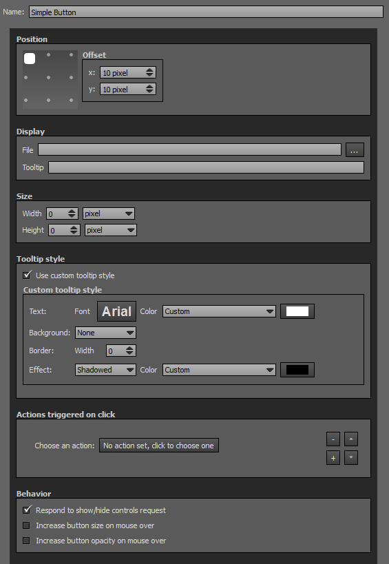
Simple Button
Simple button that can trigger actions on a user's click. Button can be an image or a Flash file (*.swf).
To add a plugin from the plugin library to your project, double click on it
Multiple Instances: Yes
This plugin can be added in multiple instances on your tour. However, it is recommended not to add too much plugin instances that may be obtrusive for your visitor.
Position
- Square with dots: sets the position and alignment you wish on your tour for the plugin. Available positions are top left, top center, top right, middle right, bottom right, bottom center, bottom left, middle left and center. Available alignment are horizontal or vertical.
- Offset: Number of pixel between the plugin border of the viewport. x values adjust horizontal offset and y values adjust vertical offset.
Display
- File: Select the file you wish to use as a button. Supported image files are *.png, *.jpg, *.jpeg, *.gif and Flash files *.swf.
- Tooltip: Enter the text you wish to display when the visitor hovers the button.
- Interaction on over: Select to have the ability to set a different icon when the over event is fired when a mouse is over the button.
- File (Over): Select the file you wish to use for the over state. Supported image files are *.png, *.jpg, *.jpeg, *.gif and Flash files *.swf.
Size
- Width: Set the width in pixels or percents of your button. Percents are based on user's viewport.
- Height: Set the height in pixels or percents of your button. Percents are based on user's viewport.
Tooltips Style
In this area you can customize the default appearance of tooltips for your whole tour.
- Text Font: Click to open a window to customize font family, font size, font weight, font effect. Please see important notice about font style display.
- Text Color: You can select the font color and opacity with the built-in color picker.
- Background:
- None: No background color.
- Color: You can select the default tooltip background color with the built-in color picker.
- Border:
- Width: Enter the tooltip default width in pixels.
- Color: Select the default tooltip border color with the built-in color picker.
- Effect:
- None: No tooltip effect.
- Shadowed: Select the shadowed effect as default tooltip effect.
- Color: Select the default tooltip effect color with the built-in color picker.
Web Safe Font Families: Important Notice About Font Style
Please note that font you choose will may not display correctly on your users device. Font family you select has to be implemented on users computers/devices. Accordingly, prefer web safe font families like:
- Georgia, serif
- Palatino Linotype, Book Antiqua, Palatino, serif
- Times New Roman, Times, serif
- Arial, Helvetica, sans-serif (Recommended for readability and compatibility).
- Arial Black, Gadget, sans-serif
- Comic Sans MS, cursive, sans-serif
- Impact, Charcoal, sans-serif
- Lucida Sans Unicode, Lucida Grande, sans-serif
- Tahoma, Geneva, sans-serif
- Trebuchet MS, Helvetica, sans-serif
- Verdana, Geneva, sans-serif
- Courier New, Courier, monospace
- Lucida Console, Monaco, monospace
Actions triggered on click
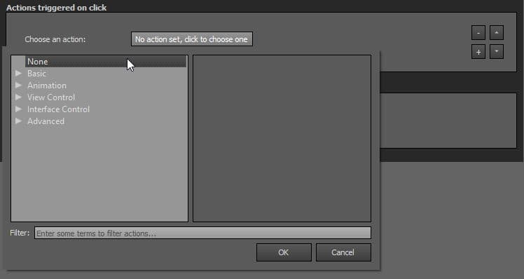
- Many actions can be assigned to the user's click on this plugin, learn all the actions available on the following Actions page.
- You can add actions on this plugin by clicking
 button.
- You can remove actions on this plugin by clicking
 button.
- You can order up (higher position, higher priority) the actions by clicking on
 button. Actions are sequentially triggered.
- You can order down (lower position, lower priority) the actions by clicking on
 button. Actions are sequentially triggered.
Behavior
- Respond to show/hide controls request: Checkbox to make the plugin reactive to a show/hide request action triggered from itself or another plugin.
- Increase button size on mouse over: When checkbox is checked, enlarges the button size when user hovers it.
- Increase button opacity on mouse over: When checkbox is checked, increase opacity of the button when user hovers it.
Social Button
Displays a single social button to share or like the tour on the following social networks:
- Google+
- Line
To add a plugin from the plugin library to your project, double click on it
Multiple Instances: Yes
This plugin can be added in multiple instances on your tour. However, it is recommended not to add too much plugin instances that may be obtrusive for your visitor.
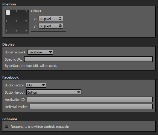
Position
- Square with dots: sets the position and alignment you wish on your tour for the plugin. Available positions are top left, top center, top right, middle right, bottom right, bottom center, bottom left, middle left. Available alignment are horizontal or vertical.
- Offset: Number of pixel between the plugin border of the viewport. x values adjust horizontal offset and y values adjust vertical offset.
Display
- Social Network: Drop-down menu to choose which social network button you wish to display. Available choices are:
- Google +
- Line
- Specific URL: By default, the tour URL is used automatically, but you can specify your own URL if you wish.
- Button Action: Drop-down menu to choose which type of Facebook button you wish to display:
- Like: Displays a "like" button type.
- Share: Displays a "share" button type.
- Button Layout: Choose the layout of the button:
- Button: Default.
- Button with horizontal counter: Displays the number of "likes" next to the button.
- Button with vertical counter: Displays the number of "likes" next to the button.
- Button with informations: Displays the number of "likes" and informations about the likes.
- Icon: Only with "Share" button action.
- Icon with Text Link: Only with "Share" button action.
- Text Link: Only with "Share" button action.
- Show Faces: Checkbox that appears according to the button action and layout choice. Allows to choose to display or not profile photos below the button.
- Button Width: Only with "Button with informations" layout. Adjust the button width in pixels.
- Application ID: Can be left blank or filled with the Application ID of a Facebook page (found in developer mode)
- Referral Tracker: A label for tracking referrals.
- Button Layout: Drop-down menu to choose which type of Twitter button you wish to display:
- Button: Default.
- Button with horizontal counter: Displays the number of "tweets" next to the button.
- Via @: Enter the text that attributes the source of a tweet to a Twitter username.
- Specific Text: Enter the title of the Tweet. If empty, the page title is used.
- Hashtag: You can specify a hashtag (without #, just text).
- Button Size: Choose a button size:
- Standard
- Large
Google+
- Button Action: Drop-down menu to choose which type of Google+ button you wish to display:
- Share
- +1: Displays the number of "likes" next to the button.
- Button Layout: Choose the layout of your Google+ button:
- Button: Default.
- Button with horizontal counter : Displays counts horizontally next to the button.
- Button with vertical counter: Displays counts vertically next to the button.
- Button with informations: Displays Google+ informations in relation with the button.
- Button Size: Choose a button size:
- Standard
- Small
- Button Width: Only with "Button with informations" layout. Adjust the button width in pixels.
Line
- Button Action: Drop-down menu to choose which type of Line button you wish to display:
- Share: Displays a "Line It!" button type.
- Like: Displays a "like" button type.
- Button Layout: Choose the layout of your Line button:
- Button: Default like button.
- Button with share : Displays the share message next to the like button.
- Line it! button: Displays default share button.
- Small green button: Displays a small green share button.
- Medium green button: Displays a medium green share button.
- Medium green button with keyword: Displays a medium green share button with the share message.
- Big green button: Displays a big green share button.
- Small grey button: Displays a small grey share button.
- Medium grey button: Displays a medium grey share button.
- Big grey button: Displays a big grey share button.
Behavior
Respond to show/hide controls request: Checkbox to make the plugin reactive to a show/hide request action triggered from itself or another plugin.
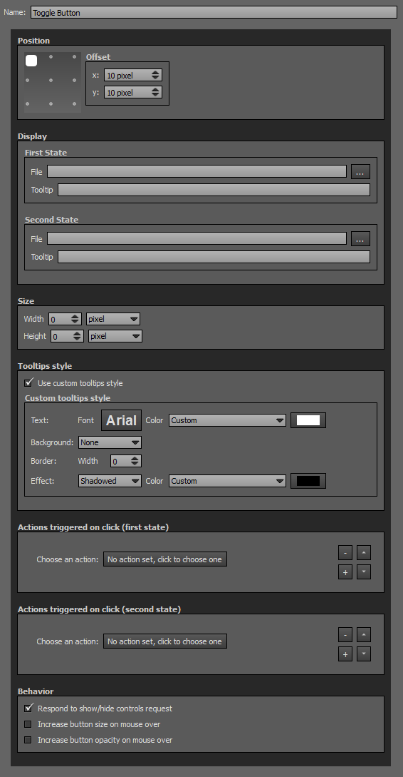
Toggle Button
Toggle button is a 2 states button that can trigger actions on a user's click (first state) and then trigger other actions on its second state. Toggle Button needs 2 files that can be images files or a Flash files (*.swf) for its 2 states.
To add a plugin from the plugin library to your project, double click on it
Multiple Instances: Yes
This plugin can be added in multiple instances on your tour. However, it is recommended not to add too much plugin instances that may be obtrusive for your visitor.
Position
- Square with dots: sets the position and alignment you wish on your tour for the plugin. Available positions are top left, top center, top right, middle right, bottom right, bottom center, bottom left, middle left and center. Available alignment are horizontal or vertical.
- Offset: Number of pixel between the plugin border of the viewport. x values adjust horizontal offset and y values adjust vertical offset.
Display
- 1st State File: Select the file you wish to use as the first state button. Supported image files are *.png, *.jpg, *.jpeg, *.gif and Flash files *.swf.
- 1st State Tooltip: Enter the text you wish to display for the first state button when the visitor hovers the button.
- 2nd State File: Select the file you wish to use as the second state button. Supported image files are *.png, *.jpg, *.jpeg, *.gif and Flash files *.swf.
- 2nd State Tooltip: Enter the text you wish to display for the second state button when the visitor hovers the button.
Size
- Width: Set the width in pixels or percents of your toggle button (for the 2 states). Percents are based on user's viewport.
- Height: Set the height in pixels or percents of your toggle button (for the 2 states). Percents are based on user's viewport.
Tooltips Style
In this area you can customize the default appearance of tooltips for your whole tour.
- Text Font: Click to open a window to customize font family, font size, font weight, font effect. Please see important notice about font style display.
- Text Color: You can select the font color and opacity with the built-in color picker.
- Background:
- None: No background color.
- Color: You can select the default tooltip background color with the built-in color picker.
- Border:
- Width: Enter the tooltip default width in pixels.
- Color: Select the default tooltip border color with the built-in color picker.
- Effect:
- None: No tooltip effect.
- Shadowed: Select the shadowed effect as default tooltip effect.
- Color: Select the default tooltip effect color with the built-in color picker.
Web Safe Font Families: Important Notice About Font Style
Please note that font you choose will may not display correctly on your users device. Font family you select has to be implemented on users computers/devices. Accordingly, prefer web safe font families like:
- Georgia, serif
- Palatino Linotype, Book Antiqua, Palatino, serif
- Times New Roman, Times, serif
- Arial, Helvetica, sans-serif (Recommended for readability and compatibility).
- Arial Black, Gadget, sans-serif
- Comic Sans MS, cursive, sans-serif
- Impact, Charcoal, sans-serif
- Lucida Sans Unicode, Lucida Grande, sans-serif
- Tahoma, Geneva, sans-serif
- Trebuchet MS, Helvetica, sans-serif
- Verdana, Geneva, sans-serif
- Courier New, Courier, monospace
- Lucida Console, Monaco, monospace
Actions triggered on click (first state)
- Many actions can be assigned to the user's click on this plugin, learn all the actions available on the following Actions page.
- You can add actions on this plugin by clicking button.
- You can remove actions on this plugin by clicking button.
- You can order up (higher position, higher priority) the actions by clicking on button. Actions are sequentially triggered.
- You can order down (lower position, lower priority) the actions by clicking on button. Actions are sequentially triggered.
Actions triggered on click (second state)
Same possibilities as Actions triggered on click (first state).
Behavior
- Respond to show/hide controls request: Checkbox to make the plugin reactive to a show/hide request action triggered from itself or another plugin.
- Increase button size on mouse over: When checkbox is checked, enlarges the button size when user hovers it.
- Increase button opacity on mouse over: When checkbox is checked, increase opacity of the button when user hovers it.
WebVR Button

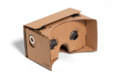
Google Cardboard
Colorcross VR

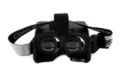
Gear VR
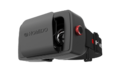
HOMiDO
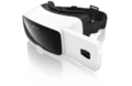
Zeiss VR One
Displays a button that can trigger an action to open the VR Mode.
To add a plugin from the plugin library to your project, double click on it
Multiple Instances: No
This plugin can be added once on your tour.
Position
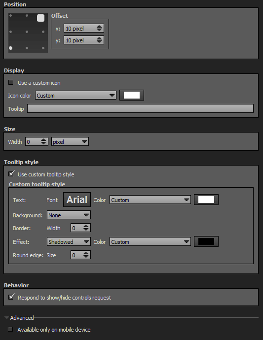
- Square with dots: sets the position and alignment you wish on your tour for the plugin. Available positions are top left, top center, top right, middle right, bottom right, bottom center, bottom left, middle left and center. Available alignment are horizontal or vertical.
- Offset: Number of pixel between the plugin border of the viewport. x values adjust horizontal offset and y values adjust vertical offset.
Display
- Use a custom icon: Unchecked by default, this option allows to use a custom icon for the enter VR button. Supported image files are *.png, *.jpg, *.jpeg, *.gif and Flash files *.swf.
- Icon color: You can select the icon color with the built-in color picker or select a project color in the dropdown menu. Project background color is defined in Project Properties > Color
- Tooltip: Enter the text to display when user hovers the enter WebVR button.
Size
- Width: Set the width in pixels or percents of your toggle button. Percents are based on user's viewport.
- Height: Set the height in pixels or percents of your toggle button. Percents are based on user's viewport.
Tooltips Style
In this area you can customize the default appearance of tooltips for your whole tour.
- Text Font: Click to open a window to customize font family, font size, font weight, font effect. Please see important notice about font style display.
- Text Color: You can select the font color and opacity with the built-in color picker.
- Background:
- None: No background color.
- Color: You can select the default tooltip background color with the built-in color picker.
- Border:
- Width: Enter the tooltip default width in pixels.
- Color: Select the default tooltip border color with the built-in color picker.
- Effect:
- None: No tooltip effect.
- Shadowed: Select the shadowed effect as default tooltip effect.
- Color: Select the default tooltip effect color with the built-in color picker.
Web Safe Font Families: Important Notice About Font Style
Please note that font you choose will may not display correctly on your users device. Font family you select has to be implemented on users computers/devices. Accordingly, prefer web safe font families like:
- Georgia, serif
- Palatino Linotype, Book Antiqua, Palatino, serif
- Times New Roman, Times, serif
- Arial, Helvetica, sans-serif (Recommended for readability and compatibility).
- Arial Black, Gadget, sans-serif
- Comic Sans MS, cursive, sans-serif
- Impact, Charcoal, sans-serif
- Lucida Sans Unicode, Lucida Grande, sans-serif
- Tahoma, Geneva, sans-serif
- Trebuchet MS, Helvetica, sans-serif
- Verdana, Geneva, sans-serif
- Courier New, Courier, monospace
- Lucida Console, Monaco, monospace
Behavior
- Respond to show/hide controls request: Checkbox to make the plugin reactive to a show/hide request action triggered from itself or another plugin.
Advanced
- Available only on mobile device: Check this box to display the enterVR button only on mobile device.
BACK TO: Documentation / Panotour Documentation