Panotour - Style - Plugins library - Loaders
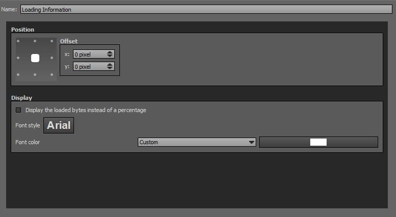
 Loading Information

This plugin displays the loading progress of the current panorama in percentage or bytes loaded on your tour.
 To add a plugin from the plugin library to your project, double click on it
Multiple Instances: No
Only one instance of this plugin can be added to your tour.
Position
- Square with dots: Sets the position you wish on your tour for the plugin. Available positions are top left, top center, top right, middle right, bottom right, bottom center, bottom left, middle left and center.
- Offset: Number of pixel that shifts the plugin from its default position. X values adjust horizontal offset and y values adjust vertical offset.
Display
- Display the Loaded Bytes instead of Percentage: Checkbox that allows to display loaded bytes instead of percentage.
- Font Style: Click to open a window to customize font family, font size, font weight, font effect. Please see important notice about font style display.
- Font Color: You can select the plugin font color and opacity with the built-in color picker or select a project color in the dropdown menu. Project colors are defined in Project Properties > Color
Web Safe Font Families: Important Notice About Font Style
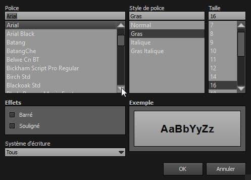
Please note that font you choose will may not display correctly on your users device. Font family you select has to be implemented on users computers/devices. Accordingly, prefer web safe font families like:
- Georgia, serif
- Palatino Linotype, Book Antiqua, Palatino, serif
- Times New Roman, Times, serif
- Arial, Helvetica, sans-serif (Recommended for readability and compatibility).
- Arial Black, Gadget, sans-serif
- Comic Sans MS, cursive, sans-serif
- Impact, Charcoal, sans-serif
- Lucida Sans Unicode, Lucida Grande, sans-serif
- Tahoma, Geneva, sans-serif
- Trebuchet MS, Helvetica, sans-serif
- Verdana, Geneva, sans-serif
- Courier New, Courier, monospace
- Lucida Console, Monaco, monospace
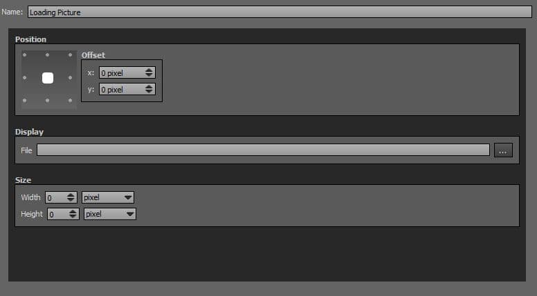
Loading Picture

This plugin displays a picture during the loading of the current panorama. It hides when the loading is finished.
To add a plugin from the plugin library to your project, double click on it
Multiple Instances: Yes
This plugin can be added in multiple instances on your tour. However, it is recommended not to add too much plugin instances that may be obtrusive for your visitor.
Position
- Square with dots: Sets the position you wish on your tour for the plugin. Available positions are top left, top center, top right, middle right, bottom right, bottom center, bottom left, middle left and center.
- Offset: Number of pixels that shifts the plugin from its default position. X values adjust horizontal offset and y values adjust vertical offset.
Display
-
 File: Select your image file to display. Supported image files types are *.png, *.jpg, *.jpeg, *.gif and Flash Files *.swf.
Size
- Width: Sets picture width in absolute (pixels) or relative (percentage) values. Default recommended values are set to pixels.
- Height: Sets picture height in absolute (pixels) or relative (percentage) values. Default recommended values are set to pixels.
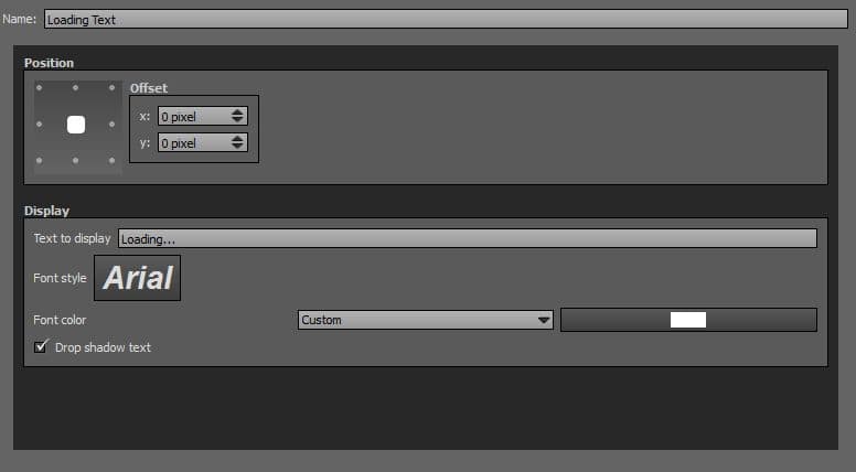
Loading Text
This plugin displays a text during the loading of the current panorama. It hides when the loading is finished.
To add a plugin from the plugin library to your project, double click on it
Multiple Instances: Yes
This plugin can be added in multiple instances on your tour. However, it is recommended not to add too much plugin instances that may be obtrusive for your visitor.
Position
- Square with dots: Sets the position you wish on your tour for the plugin. Available positions are top left, top center, top right, middle right, bottom right, bottom center, bottom left, middle left and center.
- Offset: Number of pixel that shifts the plugin from its default position. X values adjust horizontal offset and y values adjust vertical offset.
Display
- Text to Display: Enter the text you wish to display during the loading of the picture/panorama.
- Font Style: Click to open a window to customize font family, font size, font weight, font effect. Please see important notice about font style display.
- Font Color: You can select the plugin font color and opacity with the built-in color picker or select a project color in the dropdown menu. Project colors are defined in Project Properties > Color
- Drop Shadow Text: Checkbox to display or not a shadow effect on your text.
Web Safe Font Families: Important Notice About Font Style
Please note that font you choose will may not display correctly on your users device. Font family you select has to be implemented on users computers/devices. Accordingly, prefer web safe font families like:
- Georgia, serif
- Palatino Linotype, Book Antiqua, Palatino, serif
- Times New Roman, Times, serif
- Arial, Helvetica, sans-serif (Recommended for readability and compatibility).
- Arial Black, Gadget, sans-serif
- Comic Sans MS, cursive, sans-serif
- Impact, Charcoal, sans-serif
- Lucida Sans Unicode, Lucida Grande, sans-serif
- Tahoma, Geneva, sans-serif
- Trebuchet MS, Helvetica, sans-serif
- Verdana, Geneva, sans-serif
- Courier New, Courier, monospace
- Lucida Console, Monaco, monospace
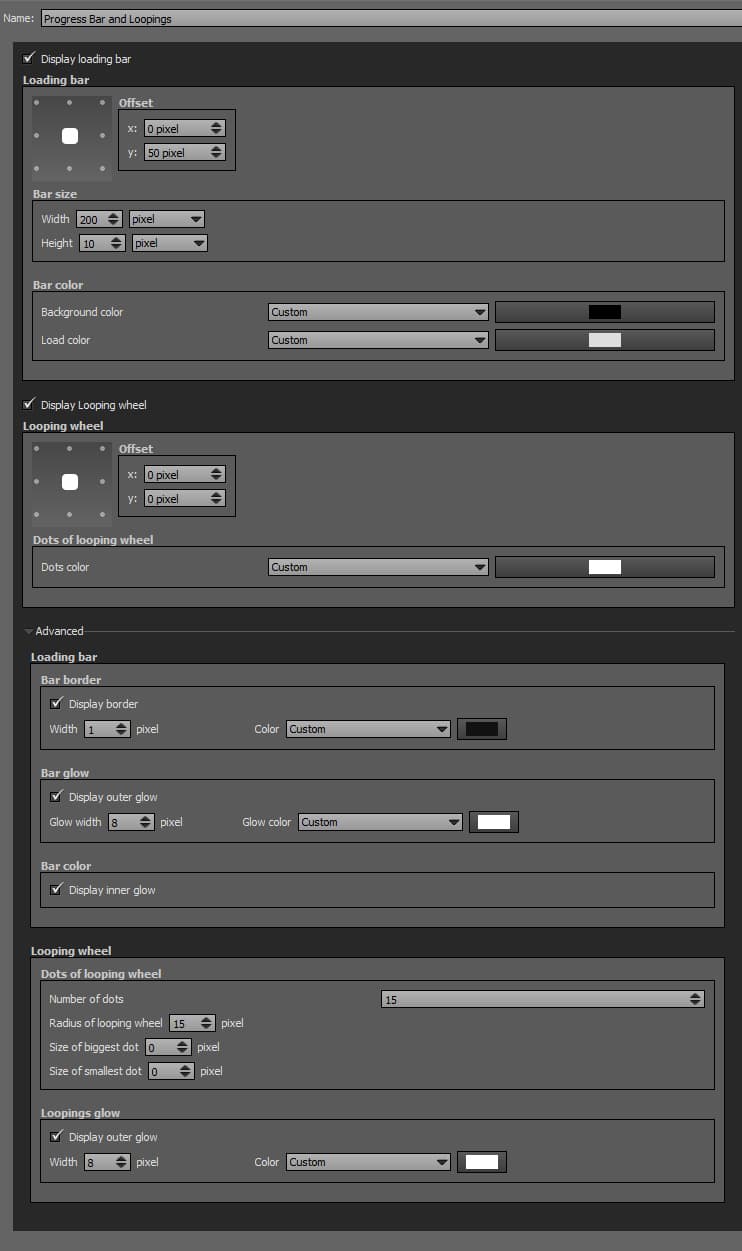
Progress Bar and Loopings

This plugin displays a progress bar and/or a looping wheel during the loading of the picture/panorama. It hides when the loading is finished.
 Watch on YouTube
 - How to Use the Progress Bar and Loopings Plugin of Panotour Pro 2
- Intro
- Progress Bar + Looping Default Example
- Progress Bar
- Progress Bar Default Example 1
- Progress Bar Example 2
- Progress Bar Example 3: Large Progress Bar
- Progress Bar Example 4: Ultra Thin Progress Bar
- Progress Bar Example 5: Thin Progress Bar
- Progress Bar Example 6: Thin Progress Bar Custom Color
- Progress Bar Example 7: Fixed Centered Progress Bar
- Progress Bar Example 8: Fixed Centered Progress Bar + Custom Colors
- Loopings
- Looping Default Example
- Looping Example 1: Position
- Looping Example 2: Position
- Looping Example 3: Looping with 7 Dots
- Looping Example 4: Looping with 3 Dots
- Looping Example 5: Looping with 40 Dots
- Looping Example 6: Large Looping
- Looping Example 7: No Outer Glow
- Looping Example 8: Custom Outer Glow
- Both Looping and Progress Bar
To add a plugin from the plugin library to your project, double click on it
Multiple Instances: No
Only one instance of this plugin can be added to your tour.
Loading Bar Position
- Square with dots: Sets the position you wish on your tour for the plugin. Available positions are top left, top center, top right, middle right, bottom right, bottom center, bottom left, middle left and center.
- Offset: Number of pixels that shifts the plugin from its default position. X values adjust horizontal offset and y values adjust vertical offset.
Loading Bar Size
- Width: Sets loading bar width in absolute (pixels) or relative (percentage) values. Default recommended values are set to pixels.
- Height: Sets loading bar height in absolute (pixels) or relative (percentage) values. Default recommended values are set to pixels.
Loading Bar Color
- Background Color: You can select the plugin background color and opacity with the built-in color picker or select a project color in the dropdown menu. Project colors are defined in Project Properties > Color.
- Load Color: You can select the plugin «already loaded» color and opacity with the built-in color picker or select a project color in the dropdown menu. Project colors are defined in Project Properties > Color.
Looping Wheel Position
- Square with dots: Sets the position you wish on your tour for the plugin. Available positions are top left, top center, top right, middle right, bottom right, bottom center, bottom left, middle left and center.
- Offset: Number of pixels that shifts the plugin from its default position. X values adjust horizontal offset and y values adjust vertical offset.
Looping Wheel Dots Colors
- Dots Color: You can select the plugin wheel color and opacity with the built-in color picker or select a project color in the dropdown menu. Project colors are defined in Project Properties > Color.
Advanced: Loading Bar
- Display Border: Checkbox to enable or disable borders options.
- Width: Sets the width in pixels of the loading bar border.
- Color: You can select the border color and opacity with the built-in color picker or select a project color in the dropdown menu. Project colors are defined in Project Properties > Color.
- Bar Glow: Checkbox to enable or disable glow options.
- Glow Width: Sets the width in pixels of the loading bar glowing effect.
- Glow Color: You can select the glow color and opacity with the built-in color picker or select a project color in the dropdown menu. Project colors are defined in Project Properties > Color.
- Bar Color: Checkbox to enable or disable inner glow.
Advanced: Looping Wheel
- Number of Dots: Sets the number of dots you wish to display on your looping wheel. 15 pixels is default value.
- Radius of Looping Wheel: Sets the radius of you looping wheel. 15 pixels is default value.
- Size of Biggest Dot: Sets the size in pixels of the biggest dot. Leave zero for default.
- Size of Smallest Dot: Sets the size in pixels of the smallest dot. Leave zero for default.
- Loopings Glow: Checkbox to enable or disable outer glow options.
- Glow Width: Sets the width in pixels of the looping wheel glowing effect. 8 pixels by default.
- Glow Color: You can select the glow color and opacity with the built-in color picker or select a project color in the dropdown menu. Project colors are defined in Project Properties > Color.
Compatibility
Note that the Progress bar and Loopings loaders are Flash, so they are not compatible with HTML5 Players.
BACK TO: Documentation / Panotour Documentation