Panotour - Style - Plugins library - Gallery
Contents
 Gallery
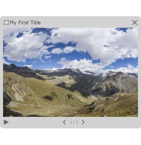
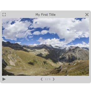
This plugin displays a image gallery in a modal lightbox window over your tour. The Gallery plugin is triggered by [Plugin] Gallery Action
- Container Style:
- Overlay:
- Title Style:
- Caption Style:
- Pictures Style:
- Advanced:
 Watch on YouTube
 FR-EN captions available
- How to Use and Edit the Gallery Plugin of Panotour Pro 2
- Preparing the Gallery to be opened:
- Adding a Gallery Plugin
- Setup of a Simple Button placed to open the Gallery on the following examples (note that this is not the only solution to open the Gallery, it is just an example)
- Choose the Action of the Plugin Gallery called «Open the Gallery»
- Manage Pictures on the Gallery:
- Examples:
 Gallery can be triggered through actions, See also Gallery Action Set
To add a plugin from the plugin library to your project, double click on it
Multiple Instances: Yes
This plugin can be added in multiple instances on your tour. However, it is recommended not to add too much plugin instances that may be obtrusive for your visitor.
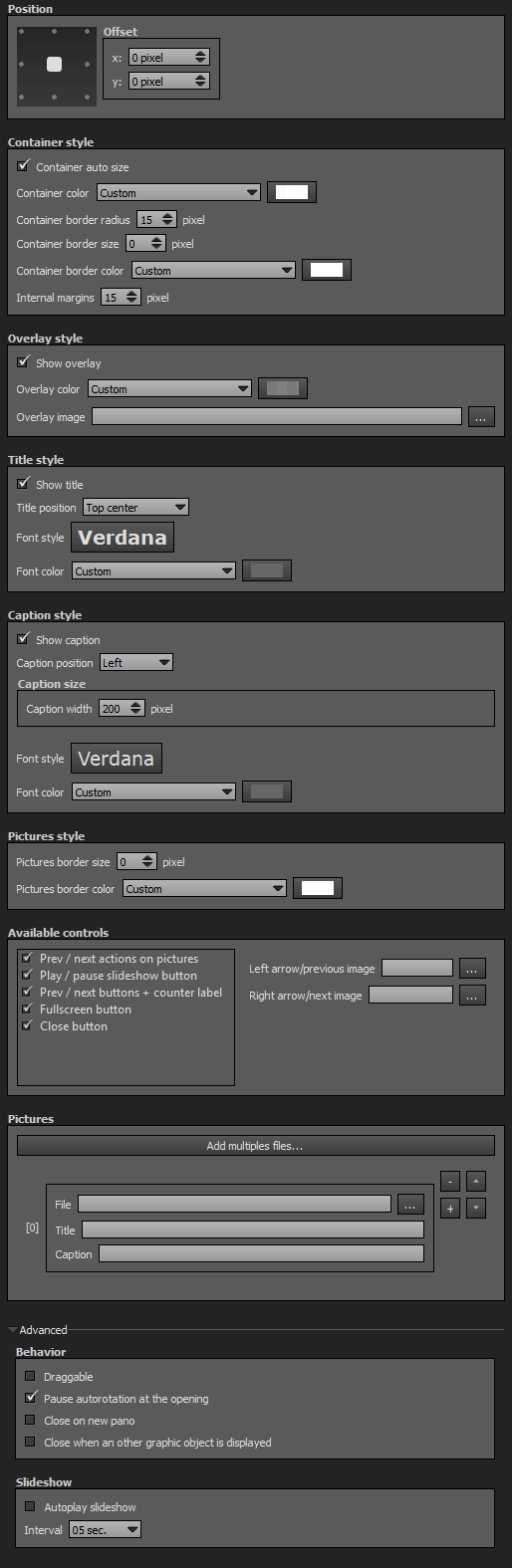
Position
- Square with dots: Sets the position you wish on your tour for the plugin. Available positions are top left, top center, top right, middle right, bottom right, bottom center, bottom left, middle left and center.
- Offset: Number of pixel that shifts the plugin from its default position. X values adjust horizontal offset and y values adjust vertical offset.
Container Style
- Container Auto Size: Checkbox to enable or disable the gallery auto sizing (checked by default and recommended). If unchecked, you can specify your gallery container width and height with absolute values (pixels) or relative values (percentage).
- Container Border Radius: Adjusts the border radius in pixels of the container.
- Container Border Size: Adjusts the border size in pixels of the container.
- Container Border Color: You can select the plugin container border color and opacity with the built-in color picker or select a project color in the dropdown menu. Project foreground color is defined in Project Properties > Color
Overlay Style
- Show Overlay: Checkbox that displays a color layer between the gallery and the tour.
- Overlay Color: You can select the overlay color and opacity with the built-in color picker or select a project color in the dropdown menu. Project foreground color is defined in Project Properties > Color
- Overlay Image: Add an image as background for the plugin.
- The image is scaled to be as large as possible so that the background area is completely covered by the background image.
- Some parts of the background image may not be in view within the background positioning area but the aspect ratio is preserved.
- Overlay image opacity is linked to the overlay color opacity.
Title Style
- Show Title: Checkbox to display or not the photo title.
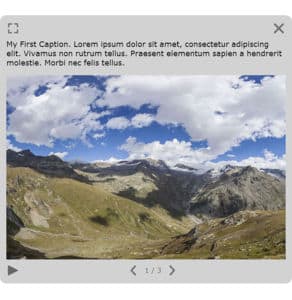
- Title Position: Drop-down menu to choose the position where you want to place the title.
«Top Left» title position
«Top Center» title position
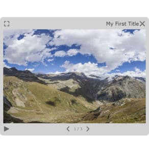
«Top Right» title position
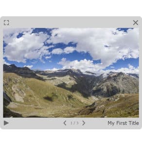
«Bottom Right» title position
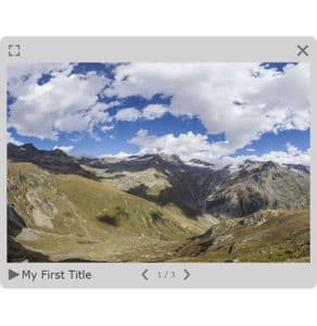
«Bottom Left» title position
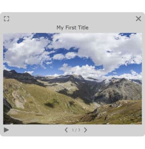
«Header» title position
«Footer» title position
- Title Font Style: Click to open a window to customize font family, font size, font weight, font effect. Please see important notice about font style display.
- Font Color: You can select the font color and opacity with the built-in color picker or select a project color in the drop-down menu. Project foreground color is defined in Project Properties > Display > Color.
Web Safe Font Families: Important Notice About Font Style
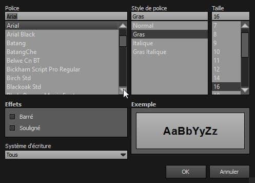
Please note that font you choose will may not display correctly on your users device. Font family you select has to be implemented on users computers/devices. Accordingly, prefer web safe font families like:
- Georgia, serif
- Palatino Linotype, Book Antiqua, Palatino, serif
- Times New Roman, Times, serif
- Arial, Helvetica, sans-serif (Recommended for readability and compatibility).
- Arial Black, Gadget, sans-serif
- Comic Sans MS, cursive, sans-serif
- Impact, Charcoal, sans-serif
- Lucida Sans Unicode, Lucida Grande, sans-serif
- Tahoma, Geneva, sans-serif
- Trebuchet MS, Helvetica, sans-serif
- Verdana, Geneva, sans-serif
- Courier New, Courier, monospace
- Lucida Console, Monaco, monospace
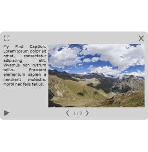
Caption Style
- Show Caption: Checkbox to display or not the caption.
- Caption Position: Drop-down menu to choose the position where you want to place the caption.
«Left» caption position
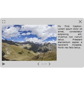
«Right» caption position
«Header» caption position
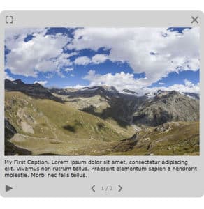
«Footer» caption position
«Footer 150px Height» caption position
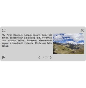
«Left 400px Width» caption position
- Caption Width: Only for Left and Right position of the caption, enter the width you wish for the caption container.
- Caption Height: Only for Header and Footer position of the caption, enter the height you wish for the caption container.
- Font Style: Click to open a window to customize font family, font size, font weight, font effect. Please see important notice about font style display.
- Font Color: You can select the font color and opacity with the built-in color picker or select a project color in the drop-down menu. Project foreground color is defined in Project Properties > Display > Color.
Web Safe Font Families: Important Notice About Font Style
Please note that font you choose will may not display correctly on your users device. Font family you select has to be implemented on users computers/devices. Accordingly, prefer web safe font families like:
- Georgia, serif
- Palatino Linotype, Book Antiqua, Palatino, serif
- Times New Roman, Times, serif
- Arial, Helvetica, sans-serif (Recommended for readability and compatibility).
- Arial Black, Gadget, sans-serif
- Comic Sans MS, cursive, sans-serif
- Impact, Charcoal, sans-serif
- Lucida Sans Unicode, Lucida Grande, sans-serif
- Tahoma, Geneva, sans-serif
- Trebuchet MS, Helvetica, sans-serif
- Verdana, Geneva, sans-serif
- Courier New, Courier, monospace
- Lucida Console, Monaco, monospace
Pictures Style
- Pictures Border Size: Adjusts the border size in pixels of each picture.
- Picture Border Color: You can select picture border color and opacity with the built-in color picker or select a project color in the dropdown menu. Project foreground color is defined in Project Properties > Color
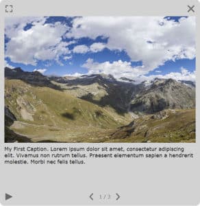
Available Controls
In this area you can select which command buttons and positions you wish to display on the gallery. Available control buttons are:
- Prev/Next actions on pictures
- Play/Pause Slideshow
- Previous/Next + Counter Label
- Fullscreen
- Close
Pictures
In this area you can build your gallery by adding all your images file by file and ordering them.
- Add Multiple Files...: Click this button to add multiple files simultaneously. When you are in your file explorer, you can select multiple files and validate the selection, all files selected are now into the gallery.
-
 File: Select your file. Supported image files types are *.png, *.jpg, *.jpeg and *.gif.
-
 Add a Picture in the Gallery after the current picture.
-
 Remove a Picture in the Gallery.
-
 Order Up.
-
 Order Down.
Advanced: Behavior
- Draggable: Checkbox to enable or disable the dragging of the gallery modal lightbox window.
- Pause Autorotation at the Opening: Checkbox to enable or disable the autorotation when gallery is opened.
- Close on New Pano: Checkbox to enable or disable the closing of the gallery when user go to another picture/panorama.
- Close when an Other Graphic Object is Displayed: Checkbox to enable or disable the closing of the gallery when user opens an other graphic object.
Advanced: Slideshow
- Autoplay Slideshow: Checkbox to enable or disable the automatic start of the slideshow.
- Interval: Adjust the amount of time in seconds before slideshow starts.
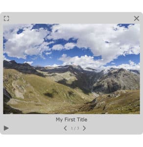
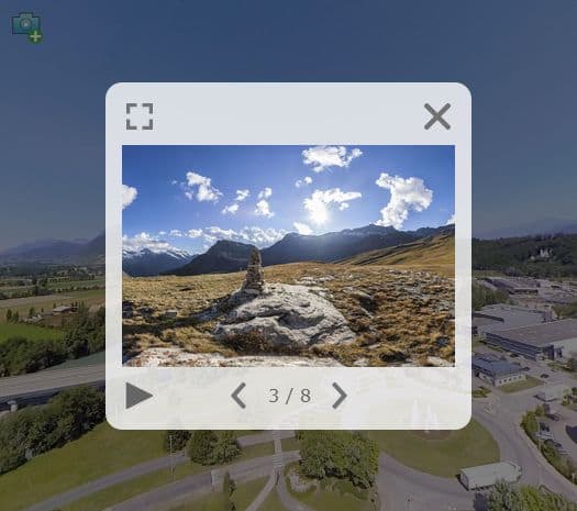
Example
Here is an example of a 8 images Gallery. The Gallery opening is triggered by a Simple Button (top left icon).
Gallery can be triggered through actions, See also Gallery Action Set
This HTML5 plugin is always displayed over the others plugins. You can order all plugins but this ordered HTML5 plugin will be always over the standard plugins. See more about Plugins Order
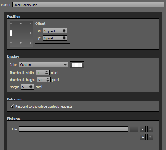
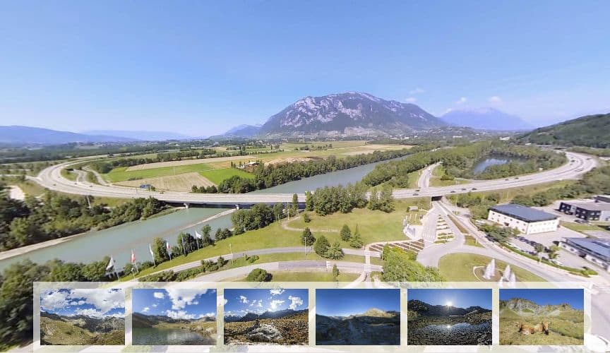
Small Gallery Bar
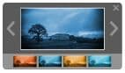
This plugin displays a thumbnail bar in which user can click to enlarge the picture over your tour.
Watch on YouTube - How Use and Edit Small Gallery Bar Plugin of Panotour Pro 2
- Add Pictures to the Small Gallery Bar
- Example 1: Default Results with the Small Gallery Bar
- Small Gallery Bar Example 2
- Small Gallery Bar Example 3
- Small Gallery Bar Example 4
- Small Gallery Bar Example 5
- Small Gallery Bar Example 6
- Small Gallery Bar Example 7
To add a plugin from the plugin library to your project, double click on it
Multiple Instances: Yes
This plugin can be added in multiple instances on your tour. However, it is recommended not to add too much plugin instances that may be obtrusive for your visitor.
Position
- Square with dots: Sets the position and alignment you wish on your tour for the plugin. Available positions are top left, top center, top right, middle right, bottom right, bottom center, bottom left, middle left. On each dot position you can align the thumbnail bar horizontally or vertically.
- Offset: Number of pixel that shifts the plugin from its default position. X values adjust horizontal offset and y values adjust vertical offset.
Display
- Color: You can select the overlay color and opacity with the built-in color picker or select a project color in the dropdown menu. Project foreground color is defined in Project Properties > Color
- Thumbnails Width: Sets the thumbnail width you wish in pixels.
- Thumbnails Height: Sets the thumbnails height you wish in pixels.
- Margin: Sets the distance in pixels between thumbnails.
Behavior
- Respond to show/hide controls request: Checkbox to make the plugin reactive to a show/hide request action triggered from itself or another plugin.
Pictures
In this area you can build your small gallery bar by adding all your images file by file and ordering them.
- File: Select your file. Supported image files types are *.png, *.jpg, *.jpeg and *.gif.
- Add a Picture in the Small Gallery Bar.
- Remove a Picture in the Small Gallery Bar.
- Order Up.
- Order Down.
Example
BACK TO: Documentation / Panotour Documentation