Panotour - Style - Plugins library - Image zone
Contents
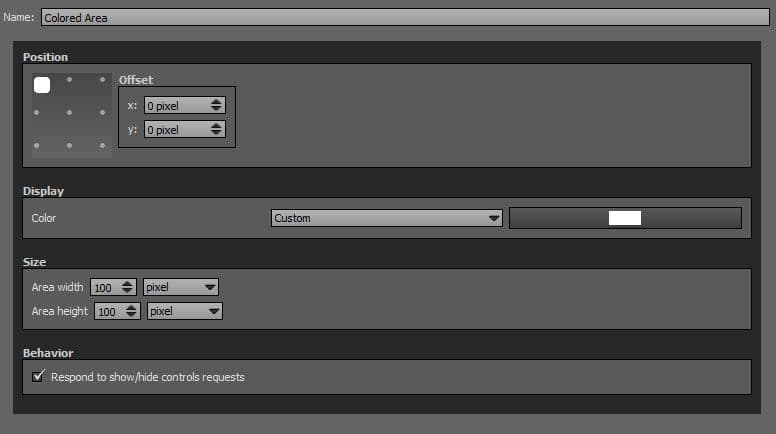
 Colored Area
This plugin displays a configurable colored area on your tour. Useful for many situations when you have to place some graphics over the tour and make them more visible.
 To add a plugin from the plugin library to your project, double click on it
Multiple Instances: Yes
This plugin can be added in multiple instances on your tour. However, it is recommended not to add too much plugin instances that may be obtrusive for your visitor.
Position
- Square with dots: Sets the position you wish on your tour for the plugin. Available positions are top left, top center, top right, middle right, bottom right, bottom center, bottom left, middle left and center.
- Offset: Number of pixel that shifts the plugin from its default position. X values adjust horizontal offset and y values adjust vertical offset.
Display
- Color: You can select area color and opacity with the built-in color picker or select a project color in the dropdown menu. Project foreground color is defined in Project Properties > Color or the group color defined in Group Properties > Color.
Size
- Area Width: Sets area width in absolute (pixels) or relative (percentage) values.
- Area Height: Sets area height in absolute (pixels) or relative (percentage) values.
Behavior
- Respond to show/hide controls request: Checkbox to make the plugin reactive to a show/hide request action triggered from itself or another plugin.
Example
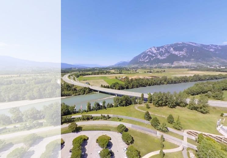
Here is an example with the following values:
- Position middle left with 0px offset.
- Color #ffffff and Alpha 180.
- Area width 200 pixels.
- Area height 100 percents.
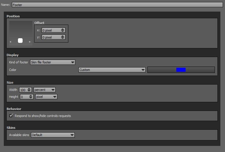
Footer
This plugin displays a configurable footer on your tour.
To add a plugin from the plugin library to your project, double click on it
Multiple Instances: Yes
This plugin can be added in multiple instances on your tour. However, it is recommended not to add too much plugin instances that may be obtrusive for your visitor.
Position
- Square with dots: Sets the position you wish on your tour for the plugin. Available positions are bottom right, bottom center and bottom left.
- Offset: Number of pixel that shifts the plugin from its default position. X values adjust horizontal offset and y values adjust vertical offset.
Display
- Kind of Footer: Dropdown menu to select which type of color scheme you wish to use. You have 3 possibilities
- Simple Colored Footer: You can select footer color and opacity with the built-in color picker or select a project color in the dropdown menu. Project foreground color is defined in Project Properties > Color.
- Skin File Footer: In addition to the color, you can add a skin pattern to your footer style in Skins.
- Custom Image File Footer: Apply a background image to your footer. Supported images files types are *.png, *.jpg, *.jpeg and *.gif. See next section «Sizes» to manage fitting.
Size
- If an image file is set for the background, image background is not repeated and fits the footer container depending on percents or pixels settings.
- Width: Sets footer width in absolute (pixels) or relative (percentage) values. Default recommended values are set to percents.
- Height: Sets footer height in absolute (pixels) or relative (percentage) values. Default recommended values are set to pixels.
Behavior
- Respond to show/hide controls request: Checkbox to make the plugin reactive to a show/hide request action triggered from itself or another plugin.
Skins
If Display settings are set to «Skin File Footer», you can choose a skin pattern in the dropdown menu. Here are examples of skin patterns available.

Skin Pattern of Footer Plugin «Big Dots»
Skin Pattern of Footer Plugin «Blur 10px»

Skin Pattern of Footer Plugin «Honeycombs»

Skin Pattern of Footer Plugin «Less Lines»

Skin Pattern of Footer Plugin «Lines»

Skin Pattern of Footer Plugin «Little Dots»

Skin Pattern of Footer Plugin «Little Squares»

Skin Pattern of Footer Plugin «Squares»
Skin Pattern of Footer Plugin «Rounder Gradient»
Header
This plugin displays a configurable header on your tour.
To add a plugin from the plugin library to your project, double click on it
Multiple Instances: Yes
This plugin can be added in multiple instances on your tour. However, it is recommended not to add too much plugin instances that may be obtrusive for your visitor.
Position
- Square with dots: Sets the position you wish on your tour for the plugin. Available positions are bottom right, bottom center and bottom left.
- Offset: Number of pixel that shifts the plugin from its default position. X values adjust horizontal offset and y values adjust vertical offset.
Display
- Kind of Header: Dropdown menu to select which type of color scheme you wish to use. You have 3 possibilities.
- Simple Colored Header: You can select header color and opacity with the built-in color picker or select a project color in the dropdown menu. Project foreground color is defined in Project Properties > Color.
- Skin File Footer: In addition to the color, you can add a skin pattern to your header style in Skins.
- Custom Image File Footer: Apply a background image to your header. Supported images files types are *.png, *.jpg, *.jpeg and *.gif. See next section «Sizes» to manage fitting.
Size
- If an image file is set for the background, image background is not repeated and fits the header container depending on percents or pixels settings.
- Width: Sets footer width in absolute (pixels) or relative (percentage) values. Default recommended values are set to percents.
- Height: Sets footer height in absolute (pixels) or relative (percentage) values. Default recommended values are set to pixels.
Behavior
- Respond to show/hide controls request: Checkbox to make the plugin reactive to a show/hide request action triggered from itself or another plugin.
Skins
If Display settings are set to «Skin File Header», you can choose a skin pattern in the dropdown menu. Here are examples of skin patterns available.
Skin Pattern of Header Plugin «Big Dots»
Skin Pattern of Header Plugin «Blur 10px»
Skin Pattern of Header Plugin «Honeycombs»
Skin Pattern of Header Plugin «Less Lines»
Skin Pattern of Header Plugin «Lines»
Skin Pattern of Header Plugin «Little Dots»
Skin Pattern of Header Plugin «Little Squares»
Skin Pattern of Header Plugin «Squares»
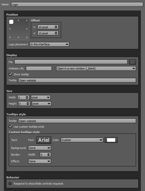
Logo
This plugin displays a configurable logo/picture on your tour. The logo/picture can be assigned to your sphere or to the interface. Similar to Picture Plugin but with more features.
 Watch on YouTube
 - How to Use the Logo Plugin of Panotour Pro 2
- Intro
- Logo Example 1 with Default Parameters
- Logo Example 2
- Logo Example 3
- Logo Example 4
- Logo Example 5
- Logo Example 6
- Logo Example 7 «In the panorama sphere» placement with Nadir position
- Logo Example 8 «In the panorama sphere» placement with Zenith position
- Logo Example 9
- Logo Example 10
- Logo Example 11
To add a plugin from the plugin library to your project, double click on it
Multiple Instances: Yes
This plugin can be added in multiple instances on your tour. However, it is recommended not to add too much plugin instances that may be obtrusive for your visitor.
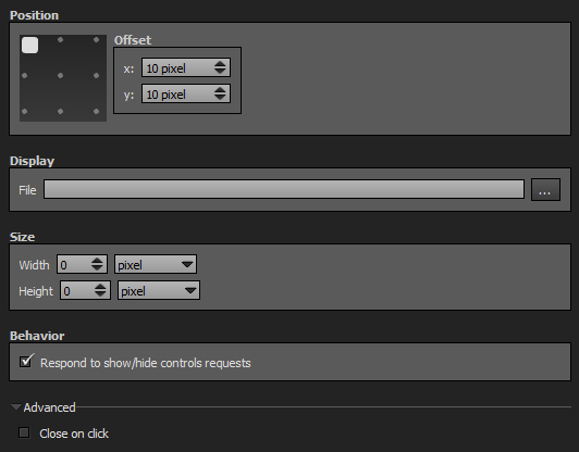
Position
- Square with dots: Sets the position you wish on your tour for the plugin. Available positions are top left, top center, top right, middle right, bottom right, bottom center, bottom left, middle left and center.
- Offset: Number of pixel that shifts the plugin from its default position. X values adjust horizontal offset and y values adjust vertical offset.
- Logo Placement in the Interface: Logo/picture is still, fixed positioned in your tour.
- Logo Placement in the Sphere: Logo/picture is part of your sphere and moves accordingly.
- At the Nadir: Logo/picture is placed at the nadir position.
- At the Zenith: Logo/picture is placed at the zenith position.
Display
-
 File: Supported images files types are *.png, *.jpg, *.jpeg, *.gif and Flash files *.swf.
- Website URL: Enter the URL if you wish to open a website when user clicks the logo/picture.
- Target Window: Dropdown menu to choose how you wish to open the link.
- Open in a new window (_blank).
- Open in the current window (_self).
- Open in the parent frame (_parent).
- Open in the top-level frame in the current window (_top).
- Tooltip: Enter the tooltip you wish to display when the user hovers your logo/picture.
Size
- Width: Sets logo width in absolute (pixels) or relative (percentage) values. Default recommended values are set to pixels.
- Height: Sets logo height in absolute (pixels) or relative (percentage) values. Default recommended values are set to pixels.
Tooltips Style
In this area you can customize the default appearance of tooltips for your whole tour.
- Text Font: Click to open a window to customize font family, font size, font weight, font effect. Please see important notice about font style display.
- Text Color: You can select the font color and opacity with the built-in color picker.
- Background:
- None: No background color.
- Color: You can select the default tooltip background color with the built-in color picker.
- Border:
- Width: Enter the tooltip default width in pixels.
- Color: Select the default tooltip border color with the built-in color picker.
- Effect:
- None: No tooltip effect.
- Shadowed: Select the shadowed effect as default tooltip effect.
- Color: Select the default tooltip effect color with the built-in color picker.
Web Safe Font Families: Important Notice About Font Style
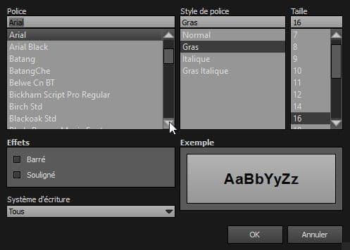
Please note that font you choose will may not display correctly on your users device. Font family you select has to be implemented on users computers/devices. Accordingly, prefer web safe font families like:
- Georgia, serif
- Palatino Linotype, Book Antiqua, Palatino, serif
- Times New Roman, Times, serif
- Arial, Helvetica, sans-serif (Recommended for readability and compatibility).
- Arial Black, Gadget, sans-serif
- Comic Sans MS, cursive, sans-serif
- Impact, Charcoal, sans-serif
- Lucida Sans Unicode, Lucida Grande, sans-serif
- Tahoma, Geneva, sans-serif
- Trebuchet MS, Helvetica, sans-serif
- Verdana, Geneva, sans-serif
- Courier New, Courier, monospace
- Lucida Console, Monaco, monospace
Behavior
- Respond to show/hide controls request: Checkbox to make the plugin reactive to a show/hide request action triggered from itself or another plugin.
Advanced
These options are only available with the Logo Placement in the Sphere Display mode.
- Change Size According to Zoom Level: Resizes or not the Logo/picture when user changes zoom level.
- Rotate the Logo with the View: Enables or not the rotation of the Logo/picture with the view. If unchecked, the logo is always in a fixed position.
Picture

This plugin displays a picture on your tour. Similar to Logo Plugin but with less features.
To add a plugin from the plugin library to your project, double click on it
Multiple Instances: Yes
This plugin can be added in multiple instances on your tour. However, it is recommended not to add too much plugin instances that may be obtrusive for your visitor.
Position
- Square with dots: Sets the position you wish on your tour for the plugin. Available positions are top left, top center, top right, middle right, bottom right, bottom center, bottom left, middle left and center.
- Offset: Number of pixel that shifts the plugin from its default position. X values adjust horizontal offset and y values adjust vertical offset.
Display
- File: Supported images files types are *.png, *.jpg, *.jpeg, *.gif and Flash files *.swf.
Size
- Width: Sets picture width in absolute (pixels) or relative (percentage) values. Default recommended values are set to pixels.
- Height: Sets picture height in absolute (pixels) or relative (percentage) values. Default recommended values are set to pixels.
Behavior
- Respond to show/hide controls request: Checkbox to make the plugin reactive to a show/hide request action triggered from itself or another plugin.
Advanced
- Close on Click: If checked, the picture is closed when the user clicks on it.
BACK TO: Documentation / Panotour Documentation