Panotour - Style tab
Contents
- 1 Main Properties Window
- 2 Navigation in Areas
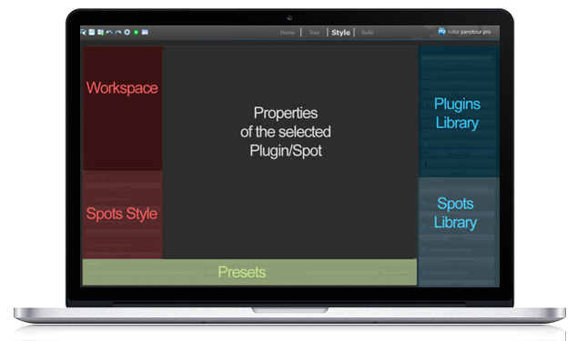
- 3 Workspace
- 4 Spots Style
- 5 Plugins Library
- 6 Spots Library
- 7 Presets
Panotour features a modular user configuration based on plugins, spots and presets. In this section you can apply some graphical customization and activate the interactive functions of the tour.
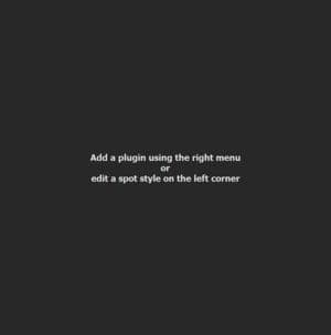
Main Properties Window
This is the biggest centered area of the Style Tab because it displays all the properties of the selected plugin or spot. In this contextual area you can edit every parameter of the plugin of spot you select. From this area, you can:
- Customize your Spots Styles
- Customize plugins from the Plugin Library
- Set and adjust your Actions
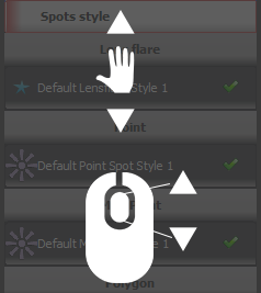
Workspace, Spots Style, Plugins Library, Spots Library contain lots of items.
- You can browse into areas using mouse wheel and dragging.
- You can vertically drag Spots Style and Spots Library areas clicking on blocks headers.
- You can maximize or minimize block areas headers, hovering them and clicking on the arrows.
Workspace
 Watch on YouTube How to Use the Workspace in Style Tab of Panotour Pro 2
- Workspace area contains all the plugins you add into your project.
- Each time you add a plugin into your tour, an instance of this plugin is listed in the workspace as an item.
- Workspace is saved in your project.
- Right Click on a Plugin
- Duplicate: Make a copy of the plugin (if applicable) with its current settings.
- Delete: Delete the current plugin.
- Drag and drop plugins to order them
- Plugin list order defines the plugin position layering in the tour.
-
 Position Preview: Quickly view each plugin position in your tour.
-
 Up and Down Arrows for Plugins Order: By clicking on it you re-arrange the order of plugins. Useful when you need to place your plugins above or under others.
-
 Remove Plugins Instances: Remove instances of plugins in the workspace by clicking on the close icon at the right of the plugin header.
Spots Style
Watch on YouTube (FR-EN captions available)
- Introduction to Spots Style
- Add Spots from Spots Library
- Remove a Spot/Set a Spot Style as Default
- Create a Custom Set of Spots Style
- Summary
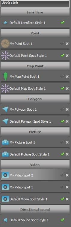
- This area contains all the spots currently included in your tour project.
- Spots Styles are saved into the project.
- Spots styles are applied when you add hotspots on your tour with the Hotspot Editor.
- Each time you add an hotspot to your tour, the category of the hotspot default style is applied to it but you can assign a customized style for each hotspot.
- Spots styles are categorized by types.
Actions on styles
- Make Default (Optional): Click on this button to set this style as default style of its Hotspot Category into the project.
- Duplicate (Optional): Click on this button to duplicate a style into the project.
- Save in Library (Optional): Click on this button to save the customized style in the Spots Library. Library is saved into the User Account of the operating system.
Categories of styles
- Not Set by Default icon
 . Means that this hotspot style is not set by default when you add a hotspot from this category. Click on the greyed checkmark to define this hotspot style as default.
- Set by Default icon
 . Means that this hotspot style is set by default when you add a hotspot from this category.
- Lens Flare: List of
 Lens Flare Hotspot Type in your tour.
- Point: List of
 Point Hotspot Type in your tour.
- Map Point (
 Panotour Pro 2 only): List of
  Web Map Hotspot Type and Floor Plan Hotspot type in your tour.
- Polygon: List of
 Polygon Hotspot Type in your tour.
- Picture: List of
 Picture Hotspot Type in your tour.
- Video ( Panotour Pro 2 only): List of
 Video Hotspot Type in your tour.
- Directional Sound ( Panotour Pro 2 only): List of
 Sound Hotspot Type in your tour.
Lens Flare Style
Properties of the Lens Flare Hotspot Type.
- Name: By default this field contains the name of the current spot style. You can edit this name according to your needs. If your project contains lot of spots, it is recommended to name it properly not to get a confusing project configuration.
Point Style
Watch on YouTube - How to Edit Point Spots Styles in Panotour Pro 2
- Display - Point Spot (Icon Library and Colors): Point Spots Style
- Display - Size: Point Spots Style
- Change Size According to Zoom Level
- Change Transparency on Hover
- Scale on Hover
- Rotation Angle
- Anchor Position
- Add Your Custom Icon File
- Add an Manage Actions for this Point Spot
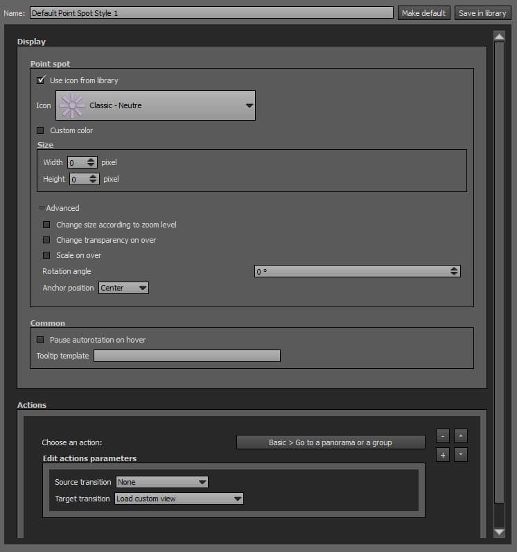
Properties of the Point Hotspot Type.
- Name: By default this field contains the name of the current spot style. You can edit this name according to your needs. If your project contains lot of spots, it is recommended to name it properly not to get a confusing project configuration.
- Make Default (Optional): Click on this button to set this hotspot style as default style of its Hotspot Category.
- Save in Library (Optional): Click on this button to save the customized hotspot in the Spots Library. Library is saved into the User Account of the operating system.
- Use Icon from Library: Choose between the many icons available for your point hotspot. Icons described as «(Sequence)» are animated hotspots. Checked by default.
-
 Icon File: Select the icon file you wish to use for the icon. Supported image file type is *.png, *.jpg, *.jpeg, *.gif and Flash files *.swf. Unchecked by default. Only available if «Use Icon from Library» is unchecked.
- Custom Color: You can select a custom color and opacity for the icon with the built-in color picker or select a project color in the dropdown menu. Project colors are defined in Project Properties > Color. This option is only available with the icon library. Unchecked by default. Only available if «Use Icon from Library» is checked.
- Size Width: Width in pixels of your icon point spot. Zero is set by default (recommended), leave zero if you wish to display icon width in its native size.
- Size height: Height in pixels of your icon point spot. Zero is set by default (recommended), leave zero if you wish to display icon height in its native size.
- Advanced:
- Change Size According to Zoom Level: Checkbox to zoom in and out or not according to the zoom level. Icon scales up and down to follow the zoom level. Note that this option may reduce display quality of your icon if zoom level is too high in comparison to the native size of the icon. Unchecked by default. Only available on spherical panoramas.
- Change Transparency on Hover: Checkbox to increase or not opacity of the point spot when user hovers it.
- Scale on Hover: Checkbox to scale up or not the point spot when the user hovers it.
- Rotation Angle: Enter the angle of rotation you wish in degrees to apply to the point spot.
- Anchor Position: Drop-down menu that defines the position origin of the spot in comparison to the hotspot place it was clicked.
- Center: Align horizontally and vertically the hotpsot according to the position where the hotspot was clicked. Selected by default and recommended.
- Bottom: Align only horizontally the hotpsot according to the position where the hotspot was clicked. Vertically, the bottom center of your icon matches the position where the hotspot was clicked.
- Pause Autorotation on Hover: Checkbox to pause or not the autorotation when user hovers the spot.
- Tooltip text or placeholder : Dynamic text display of the tooltip. The following placeholders can be used inside the tooltip :
- «%p» (case sensitive) for displaying target scene title name.
- «%d» (case sensitive) for displaying the target scene description.
- «%DISTANCEINMETERS%» (case sensitive) for displaying the distance in meters between the current scene and the target scene. Both scenes have to be geolocalised.
- «%DISTANCEINKILOMETERS%» (case sensitive) for displaying the distance in kilometers between the current scene and the target scene. Both scenes have to be geolocalised.
- «%DISTANCEINMILES%» (case sensitive) for displaying the distance in miles between the current scene and the target scene. Both scenes have to be geolocalised.
- «%DISTANCEINYARDS%» (case sensitive) for displaying the distance in yards between the current scene and the target scene. Both scenes have to be geolocalised.
- «%DISTANCEINFEET%» (case sensitive) for displaying the distance in feet between the current scene and the target scene. Both scenes have to be geolocalised.
- Tooltip rule for desktop: Tooltip can be available permanently or when the mouse is over the point spot.
- Tooltip rule for tablet/mobile devices: Tooltip can be available permanently or masked on touch devices.
- Tooltip rule for VR mode: Tooltip can be available permanently or masked when reaching the VR mode.
- Actions
- Default Action for the Point Spot is «Go to a Panorama or a Group».
- You can add several Actions on this Spot Style.
-
 Add an Action.
-
 Remove an Action.
-
 Order Up.
-
 Order Down.
Add a Point Style
To add a point style, go to the Spots Library and double click on the point spot you wish to add. If no customized spot is added to the Spots Library, there is only the Default Point Style Available.
 Map Point Style
Watch on YouTube - How to Edit Map Point Spots Styles in Panotour Pro 2
- Edit Name: Map Spots Style
- Use Icon From Library: Map Spots Style
- Custom Color for the Icon: Map Spots Style
- Size Width and Height: Map Spots Style
- Anchor Position: Map Spots Style
- Add Your Icon File for the Map Spot: Map Spots Style
- Actions: Map Spots Style
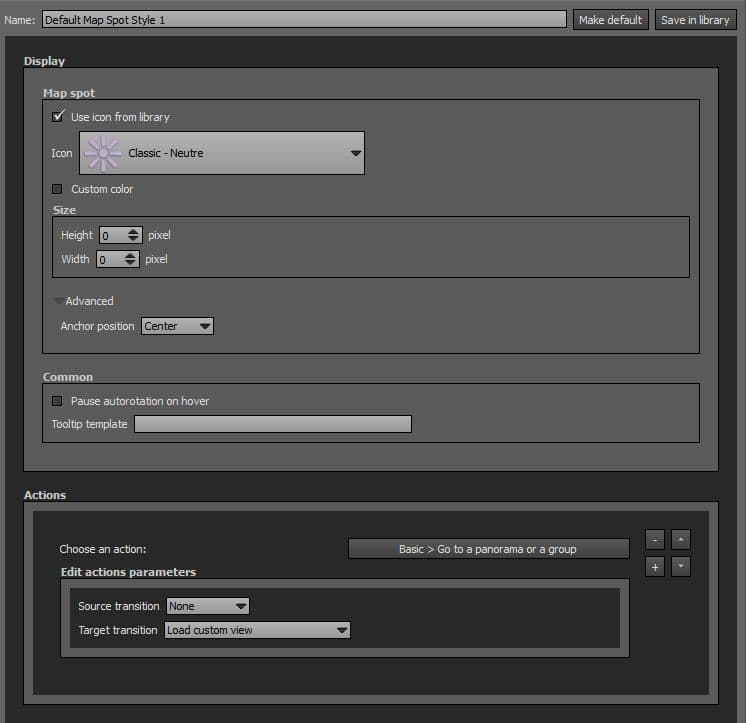
Properties of the Web Map Hotspot Type and Floor Plan Hotspot type.
- Name: By default this field contains the name of the current spot style. You can edit this name according to your needs. If your project contains lot of spots, it is recommended to name it properly not to get a confusing project configuration.
- Make Default (Optional): Click on this button to set this hotspot style as default style of its Hotspot Category.
- Save in Library (Optional): Click on this button to save the customized hotspot in the Spots Library. Library is saved into the User Account of the operating system.
- Use Icon from Library: Choose between the many icons available for your map point hotspot. Icons described as «(Sequence)» are animated hotspots. Checked by default.
- Icon File: Select the icon file you wish to use for the icon. Supported image file type is *.png, *.jpg, *.jpeg, *.gif and Flash files *.swf. Unchecked by default. Only available if «Use Icon from Library» is unchecked.
- Custom Color: You can select a custom color and opacity for the icon with the built-in color picker or select a project color in the dropdown menu. Project colors are defined in Project Properties > Color. This option is only available with the icon library. Unchecked by default. Only available if «Use Icon from Library» is checked.
- Size Width: Width in pixels of your icon map point spot. Zero is set by default (recommended), leave zero if you wish to display icon width in its native size.
- Size height: Height in pixels of your map icon point spot. Zero is set by default (recommended), leave zero if you wish to display icon height in its native size.
- Anchor Position: Drop-down menu that defines the position origin of the spot in comparison to the hotspot place it was clicked.
- Center: Align horizontally and vertically the hotpsot according to the position where the hotspot was clicked. Selected by default and recommended.
- Bottom: Align only horizontally the hotpsot according to the position where the hotspot was clicked. Vertically, the bottom center of your icon matches the position where the hotspot was clicked.
- Pause Autorotation on Hover: Checkbox to pause or not the autorotation when user hovers the spot.
- Tooltip Template: Dynamic text display of the tooltip. For the moment only «%p» (case sensitive) is supported for displaying target picture/panorama Title Name.
- Actions:
- Default Action for the Map Point Spot is «Go to a Panorama or a Group».
- You can add several Actions on this Spot Style.
- Add an Action.
- Remove an Action.
- Order Up.
- Order Down.
Add a Map Point Style
To add a map point style, go to the Spots Library and double click on the map point spot you wish to add. If no customized spot is added to the Spots Library, there is only the Default Map Point Style Available.
Polygon Style
Watch on YouTube - How to Edit Polygon Spots Style in Panotour Pro 2
- Enter a Name for the Polygon Spot Style
- «On Hover» Display Behavior for the Polygon Spot Style
- «Never» Display Behavior for the Polygon Spot Style
- «Always» Display Behavior for the Polygon Spot Style
- Border and Fill Colors for the Polygon Spot Style
- Alternative Spots and Common Parameters for the Polygon Spot Style
- Tooltip Template
- Mix Static and Dynamic Content for your Tooltip of the Polygon Spot Style
- Actions:
Properties of the Polygon Hotspot Type.
- Name: By default this field contains the name of the current spot style. You can edit this name according to your needs. If your project contains lot of spots, it is recommended to name it properly not to get a confusing project configuration.
- Make Default (Optional): Click on this button to set this hotspot style as default style of its Hotspot Category.
- Save in Library (Optional): Click on this button to save the customized hotspot in the Spots Library. Library is saved into the User Account of the operating system.
- Hotspots Displayed: Drop-down menu to select the polygon hotspot behavior.
- Always: Polygon hotspot is always visible.
- On Hover: Polygon hotspot is only visible when user hovers it.
- Never: Polygon hotspot is active but not visible.
- Border Color: You can select a custom border color and opacity for the polygon with the built-in color picker or select a project color in the dropdown menu. Project colors are defined in Project Properties > Color.
- Fill Color: You can select a custom fill color and opacity for the polygon with the built-in color picker or select a project color in the dropdown menu. Project colors are defined in Project Properties > Color.
- Pause Autorotation on Hover: Checkbox to pause or not the autorotation when user hovers the spot.
- Tooltip Template : Dynamic text display of the tooltip. For the moment only «%p» (case sensitive) for displaying target picture/panorama title name, and «%d» (case sensitive) for displaying the target picture/panorama description are supported.
- Actions:
- Default Action for the Map Point Spot is «Go to a Panorama or a Group».
- You can add several Actions on this Spot Style.
- Add an Action.
- Remove an Action.
- Order Up.
- Order Down.
Add a Polygon Style
To add a polygon style, go to the Spots Library and double click on the polygon spot you wish to add. If no customized spot is added to the Spots Library, there is only the Default Polygon Style Available.
Picture Style
Properties of the Picture Hotspot Type.
- Name: By default this field contains the name of the current spot style. You can edit this name according to your needs. If your project contains lot of spots, it is recommended to name it properly not to get a confusing project configuration.
- Make Default (Optional): Click on this button to set this hotspot style as default style of its Hotspot Category.
- Save in Library (Optional): Click on this button to save the customized hotspot in the Spots Library. Library is saved into the User Account of the operating system.
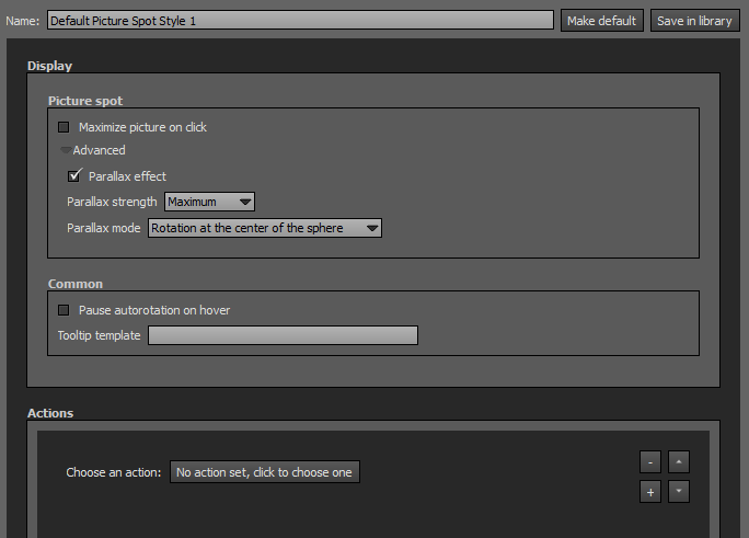
- Maximize Picture on Click: Checkbox to maximize or not the picture on user click.
- Maximized Width: Enter the width in pixels you wish for the maximized picture. If you want let the browser fit the picture width automatically, leave the field set to zero (default).
- Maximized Height: Enter the height in pixels you wish for the maximized picture. If you want let the browser fit the picture height automatically, leave the field set to zero (default).
- Hidden when not Maximized: Checkbox to make or not the picture visible only on user click. Unchecked by default.
- Advanced:
- Parallax Effect: Checkbox to enable or not the parallax effect to the picture spot.
- Parallax Strength: Drop-down menu to choose the amount of parallax effect you wish for this picture style: Small, Medium, Large, Maximum.
- Parallax Mode: Drop-down menu to choose the parallax behaviour:
- Move in the same direction as the sphere: Picture spot moves in the same direction as the sphere.
- Move in the opposite direction of the sphere: Picture spot moves in the opposite direction of the sphere.
- Pause Autorotation on Hover: Checkbox to pause or not the autorotation when user hovers the spot.
- Tooltip Template : Dynamic text display of the tooltip. For the moment only «%p» (case sensitive) for displaying target picture/panorama title name, and «%d» (case sensitive) for displaying the target picture/panorama description are supported.
- Actions:
Add a Picture Style
To add a picture style, go to the Spots Library and double click on the picture spot you wish to add. If no customized spot is added to the Spots Library, there is only the Default Picture Style Available.
Video Style
 See live examples
Watch on YouTube FR-EN captions available
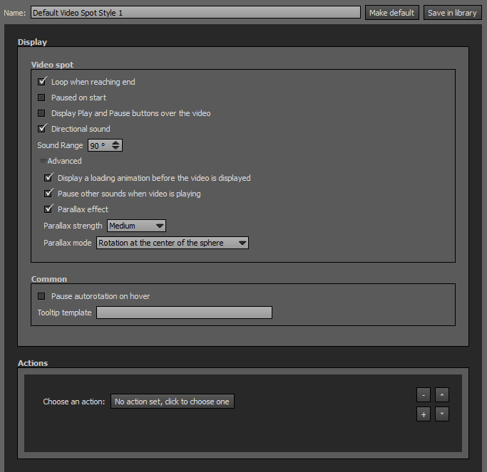
Properties of the Video Hotspot Type.
- Name: By default this field contains the name of the current spot style. You can edit this name according to your needs. If your project contains lot of spots, it is recommended to name it properly not to get a confusing project configuration.
- Make Default (Optional): Click on this button to set this hotspot style as default style of its Hotspot Category.
- Save in Library (Optional): Click on this button to save the customized hotspot in the Spots Library. Library is saved into the User Account of the operating system.
- Loop when Reaching End: Checkbox to loop or not the video when it reaches the end.
- Paused on Start: Checkbox to pause or not the video when the picture/panorama is opened.
- Display Play and Pause Buttons over the Video: Checkbox to display or not a play/pause toggle button over the video. The toggle button is display at the center of the video.
- Directional Sound: Checkbox to enable or not the directional sound on the video. Directional sound is in your visitor's viewport. When user drags the sphere with a video hotspot into the zone, a realistic volume and stereo effect is heard according to the user movements, as it would be in a real situation. This feature is checked by default.
- Compatibility: Directional sound is not compatible with HTML5 Players.
- Important Note: If not checked, this function may become obtrusive for users because sound is played even if the video is not in the view.
- Sound Range: Enter the sound field angle you wish in degrees. 90° by default, recommended because it matches the human vision field of view. The more you enter a low value, the more you get a directional sound.
- Advanced:
- Display a Loading Animation Before the Video is Displayed: Checkbox to display or not an loading animation during the video loading. Checked by default.
- Pause other sounds when video is playing: Checkbox to mute or not any other sound (like background sounds, etc) than the video sound when the video is playing.
- Parallax Effect: Checkbox to enable or not the parallax effect to the video spot.
- Parallax Strength: Drop-down menu to choose the amount of parallax effect you wish for this video spot style: Small, Medium, Large, Maximum.
- Parallax Mode: Drop-down menu to choose the parallax behaviour:
- Move in the same direction as the sphere: Video spot moves in the same direction as the sphere.
- Move in the opposite direction of the sphere: Video spot moves in the opposite direction of the sphere.
- Pause Autorotation on Hover: Checkbox to pause or not the autorotation when user hovers the spot.
- Tooltip Template : Dynamic text display of the tooltip. For the moment only «%p» (case sensitive) for displaying target picture/panorama title name, and «%d» (case sensitive) for displaying the target picture/panorama description are supported.
- Actions:
Add a Video Style
To add a video style, go to the Spots Library and double click on the video spot you wish to add. If no customized spot is added to the Spots Library, there is only the Default Video Style Available.
Directional Sound Style
Watch on YouTube - How to Edit a Directional Sound Spot Style in Panotour Pro 2
- Enter a Custom Name for the Directional Sound Spot Style
- Endless Sound Feature for the Directional Sound Spot Style
- Hear an Example for the Directional Sound with a 90° Sound Range (default)
- Number of Loops for the Directional Sound Spot Style
- Sound Range for the Directional Sound Spot Style
- Hear an Example for the Directional Sound with a 30° Sound Range
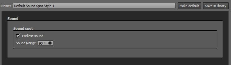
Properties of the Sound Hotspot Type.
- Name: By default this field contains the name of the current spot style. You can edit this name according to your needs. If your project contains lot of spots, it is recommended to name it properly not to get a confusing project configuration.
- Make Default (Optional): Click on this button to set this hotspot style as default style of its Hotspot Category.
- Save in Library (Optional): Click on this button to save the customized hotspot in the Spots Library. Library is saved into the User Account of the operating system.
- Endless Sound: Checkbox to loop or not the sound hotspot. Checked by default.
- Sound Range: Enter the sound field angle you wish in degrees. 90° by default, recommended because it matches the human vision field of view. The more you enter a low value, the more you get a directional sound. When user drags the sphere with a sound hotspot into the zone, a realistic volume and stereo effect is heard according to the user movements, as it would be in a real situation. This feature is checked by default.
- Compatibility: Directional sound is not compatible with HTML5 Players.
Add a Sound Style
To add a sound style, go to the Spots Library and double click on the directional sound you wish to add. If no customized spot is added to the Spots Library, there is only the Default Directional Sound Style Available.
Plugins Library
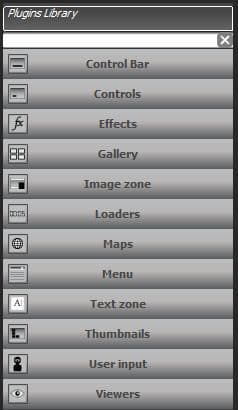
Plugins are tools, functions that can be added into your tour project according to your needs. Plugins add features and interactions to your tour. You can choose and customize your plugins the way you like. Each plugin has its own parameters, can be self controlled or triggered through Actions you can assign to. By default, your Panotour project does not contain any plugin but you can add as much plugins as you want. However, it is recommended not to add too much plugins that may be obtrusive for your visitor. You can add a plugin to your project by double clicking on it. Here is the list of available plugins in Panotour:
- Control Bar: Displays toolbars plugins with basic controls that allows users to interact with your tour (Zoom in and out, Next and Previous Panorama, Mouse Control Mode, Show and Hide Controls, Move Up Down Right and Left, etc).
- Controls: Plugins with button type behavior on which you can assign Actions. Some plugins have already actions defined.
- Effects: Plugins that add effects to your tour (Rain, Snow, etc).
- Gallery: Plugins dedicated to the display of images galleries on your tour.
- Image Zone: Plugins dedicated to the display an image or a colored area on your tour.
- Loaders: Plugins to display loading progresses of images or texts.
- Maps: Plugins dedicated to maps and floor plans.
- Menus: Plugins that display menus of the pictures/panoramas included in your tour.
- Text Zone: Plugins used to display Pictures/Panoramas Titles/Names, Group Titles/Names, Project Titles/Names and Pictures/Panoramas Descriptions, Group Descriptions and Project Descriptions.
- Thumbnails: Plugins that display thumbnails menus of the pictures/panoramas included in your tour.
- User Input: Plugins relative to user movements and actions on the tour.
- Viewers: Players types plugins made to display special type of contents like PDF, External Video, Videos, Websites, etc.
- You can create and develop your own plugin.
Add a Plugin
Simply double click on a plugin to add it to your project.
Spots Library
Watch on YouTube - How to Use Spots Library of Panotour Pro 2
- Add a Spot Style to the Spots Library
- Add a Spot Style to the Project from the Spot Library
- Enter a Custom Name for the Spot Style
- Customizing the Spot Style to your Needs
- «Save in Library» Button
- Add a Spot Style to the Project from the Spots Library
- Delete a Spot Style From the Spots Library
- Delete a Spot Style From the Project
- Add a Spot Style to the Spots Library from a Default Spot of the Project
- Quickly create several matching custom spots
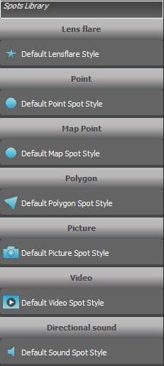
- The Spot Library contains all the default spots styles available in Panotour.
- This area contains all the «Save in Libray» spots available.
- Spots Library is saved into the User Account of the operating system.
- Spots styles are applied when you add hotspots on your tour with the Hotspot Editor.
- Each time you add an hotspot to your tour, the category of the hotspot default style is applied to it but you can assign a customized style for each hotspot.
- Spots Library is organized by categories of hotspots.
Add a Spot Style to Spots Library
- Customize a spot.
- Enter a Name in the Name field.
- Click on the «Save in Library» button. Your customized spot is then saved in the Spots Library and can be used for your coming projects.
Add a Spot to Project from Spots Library
Simply double click on a spot style to add it to your project. If no customized spot is added to the Spots Library, you will only find the default spot style for each category.
Presets
Watch on YouTube

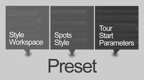
Presets allows to backup a configuration of your Style Workspace + Spots Style + Tour Start Parameters into files you can recall later. Presets are really useful when you have set up a complete tour project, then you can save the configuration of every added plugin and spots you have customized without the assets.
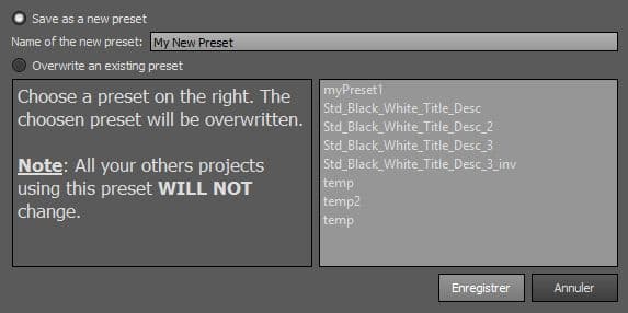
- Save as a New Preset: Allows to save your Style Workspace + Spots Style + Tour Start Parameters
- Name of the New Preset: Enter the name you wish for your Preset. Note that if you enter a already used preset name, the preset is saved anyway with the same file name and you can get several presets with the same file name.
- Overwrite an Existing Preset: Click on an existing preset to overwrite it. Note that projects using this preset will not change.
- Save: Click on this button to save your Preset.
- Cancel: Click on this button to cancel and go back to Style Tab.
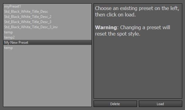
- Choose an existing Preset by clicking on it and click Load to open and apply the settings of the Preset.
- Delete: Use this button to delete the selected Preset.
- Click anywhere else on Panotour window to quit.
- Note that loading a Preset resets your Spots Style and Plugins Workspace.
BACK TO: Documentation / Panotour Documentation