Panotour - Style - Plugins library - Video
Contents
- 1 Video Control Bar
- 2 Video Progress Bar
 Video Control Bar
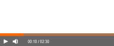
Displays a control bar for the videos scenes.
Multiple Instances: No
This plugin can be added once on your tour.
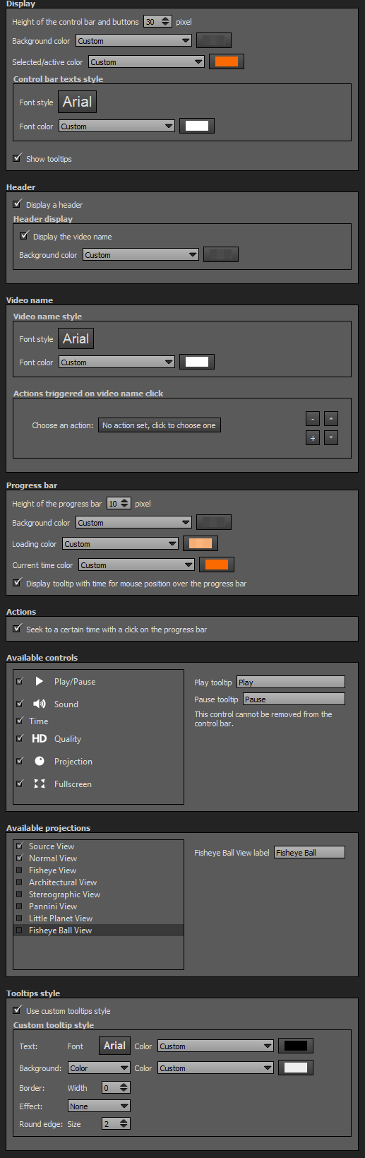
Display
- Height of the control bar and buttons: Enter the number of pixels you wish for the height of the control bar and its buttons. Default value is 30 pixels.
- Background Color: You can select the background color and opacity for the video control bar with the built-in color picker or select a project color in the drop-down menu. Project colors are defined in Project Properties > Color.
- Select/Active Color: You can select the selected and active color and opacity for the video control bar with the built-in color picker or select a project color in the drop-down menu. Project colors are defined in Project Properties > Color.
- Control Bar Texts Style
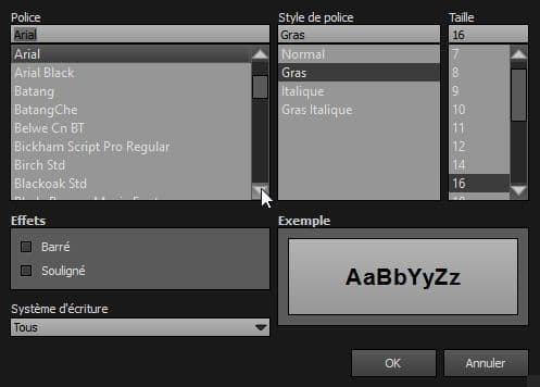
- Font Style: Click to open a window to customize font family, font size, font weight, font effect. Please see important notice about font style display.
- Font Color: You can select the font color and opacity with the built-in color picker or select a project color in the dropdown menu. Project colors are defined in Project Properties > Color.
Header
- Display a Header: Unchecked by default, this option allows to display or not a header when the video scene is playing.
- Display the Video Name: Choose to display or not to display the video scene name.
- Background Color: You can select the background color and opacity for the header of the video scene with the built-in color picker or select a project color in the drop-down menu. Project colors are defined in Project Properties > Color.
- Height of the Header: Only when "Display the Video Name" is unchecked. Enter the height of the header. Default value is 30 pixels.
Progress Bar
- Height of the Progress Bar: Enter the height you wish for the progress bar. Default value is 10 pixels.
- Background Color: You can select the background color and opacity for the progress bar with the built-in color picker or select a project color in the drop-down menu. Project colors are defined in Project Properties > Color.
- Loading Color: You can select the loading color and opacity for the progress bar with the built-in color picker or select a project color in the drop-down menu. Project colors are defined in Project Properties > Color.
- Current Time Color: You can select the current time color and opacity for the progress bar with the built-in color picker or select a project color in the drop-down menu. Project colors are defined in Project Properties > Color.
- Display tooltip with time for mouse position over the progress bar: Checked by default.
Video Name
- Video Name Style
- Font Style: Click to open a window to customize font family, font size, font weight, font effect. Please see important notice about font style display.
- Font Color: You can select the font color and opacity with the built-in color picker or select a project color in the dropdown menu. Project colors are defined in Project Properties > Color.
Actions Triggered on Video Name Click
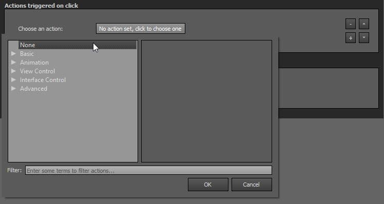
- Many actions can be assigned to the user's click on this plugin, learn all the actions available on the following Actions page.
- You can add actions on this plugin by clicking
 button.
- You can remove actions on this plugin by clicking
 button.
- You can order up (higher position, higher priority) the actions by clicking on
 button. Actions are sequentially triggered.
- You can order down (lower position, lower priority) the actions by clicking on
 button. Actions are sequentially triggered.
Actions
- Seek to a certain time with a click on the progress bar: Allows or disallows the seek when user clicks on the progress bar.
Available Controls
- Play / Pause: Play and pause buttons
- Sound: Mute sound on and off
- Time: Display or not the video scene time
- HD: Display or not the High Definition version of the video scene
- Projection: Projections button
- Fullscreen: Fullscreen button
Tooltips can also be customized with your own text.
Available Projections
- Source view (checked by default)
- Normal view (checked by default)
- Fisheye view
- Architectural view
- Stereographic view
- Pannini view
- Little planet view
- Fisheye ball view
Projections labels can also be customized with your own text.
Tooltips Style
In this area you can customize the default appearance of tooltips for your whole tour.
- Text Font: Click to open a window to customize font family, font size, font weight, font effect. Please see important notice about font style display.
- Text Color: You can select the font color and opacity with the built-in color picker.
- Background:
- None: No background color.
- Color: You can select the default tooltip background color with the built-in color picker.
- Border:
- Width: Enter the tooltip default width in pixels.
- Color: Select the default tooltip border color with the built-in color picker.
- Effect:
- None: No tooltip effect.
- Shadowed: Select the shadowed effect as default tooltip effect.
- Color: Select the default tooltip effect color with the built-in color picker.
Web Safe Font Families: Important Notice About Font Style
Please note that font you choose will may not display correctly on your users device. Font family you select has to be implemented on users computers/devices. Accordingly, prefer web safe font families like:
- Georgia, serif
- Palatino Linotype, Book Antiqua, Palatino, serif
- Times New Roman, Times, serif
- Arial, Helvetica, sans-serif (Recommended for readability and compatibility).
- Arial Black, Gadget, sans-serif
- Comic Sans MS, cursive, sans-serif
- Impact, Charcoal, sans-serif
- Lucida Sans Unicode, Lucida Grande, sans-serif
- Tahoma, Geneva, sans-serif
- Trebuchet MS, Helvetica, sans-serif
- Verdana, Geneva, sans-serif
- Courier New, Courier, monospace
- Lucida Console, Monaco, monospace
Behavior
Respond to show/hide controls request: Checkbox to make the plugin reactive to a show/hide request action triggered from itself or another plugin.
Web Safe Font Families: Important Notice About Font Style
Please note that font you choose will may not display correctly on your users device. Font family you select has to be implemented on users computers/devices. Accordingly, prefer web safe font families like:
- Georgia, serif
- Palatino Linotype, Book Antiqua, Palatino, serif
- Times New Roman, Times, serif
- Arial, Helvetica, sans-serif (Recommended for readability and compatibility).
- Arial Black, Gadget, sans-serif
- Comic Sans MS, cursive, sans-serif
- Impact, Charcoal, sans-serif
- Lucida Sans Unicode, Lucida Grande, sans-serif
- Tahoma, Geneva, sans-serif
- Trebuchet MS, Helvetica, sans-serif
- Verdana, Geneva, sans-serif
- Courier New, Courier, monospace
- Lucida Console, Monaco, monospace
Video Progress Bar

Displays a progress bar for the videos scenes.
Multiple Instances: No
This plugin can be added once on your tour.
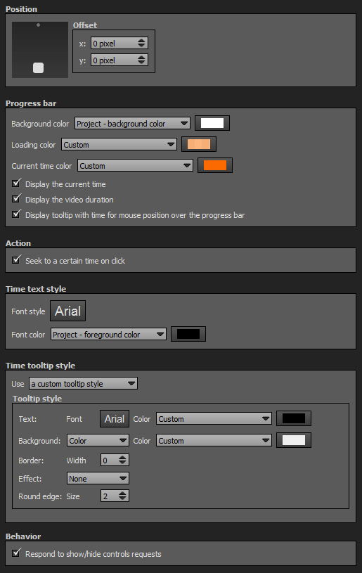
Position
- Square with dots: Sets the position and alignment you wish on your tour for the plugin. Available positions are top center and bottom center.
- Offset: Number of pixel between the plugin border of the viewport. x values adjust horizontal offset and y values adjust vertical offset.
Progress Bar
- Background Color: You can select the background color and opacity for the progress bar with the built-in color picker or select a project color in the drop-down menu. Project colors are defined in Project Properties > Color.
- Loading Color: You can select the loading color and opacity for the progress bar with the built-in color picker or select a project color in the drop-down menu. Project colors are defined in Project Properties > Color.
- Current Time Color: You can select the current time color and opacity for the progress bar with the built-in color picker or select a project color in the drop-down menu. Project colors are defined in Project Properties > Color.
- Display the Current Time: Checked by default.
- Display the Video Duration: Checked by default.
- Display tooltip with time for mouse position over the progress bar: Checked by default.
Actions
- Seek to a certain time on click: Allows or disallows the seek when user clicks on the progress bar.
Time Text Style
- Font Style: Click to open a window to customize font family, font size, font weight, font effect. Please see important notice about font style display.
- Font Color: You can select the font color and opacity with the built-in color picker or select a project color in the dropdown menu. Project colors are defined in Project Properties > Color.
Tooltips Style
In this area you can customize the default appearance of tooltips for your whole tour.
- Text Font: Click to open a window to customize font family, font size, font weight, font effect. Please see important notice about font style display.
- Text Color: You can select the font color and opacity with the built-in color picker.
- Background:
- None: No background color.
- Color: You can select the default tooltip background color with the built-in color picker.
- Border:
- Width: Enter the tooltip default width in pixels.
- Color: Select the default tooltip border color with the built-in color picker.
- Effect:
- None: No tooltip effect.
- Shadowed: Select the shadowed effect as default tooltip effect.
- Color: Select the default tooltip effect color with the built-in color picker.
Web Safe Font Families: Important Notice About Font Style
Please note that font you choose will may not display correctly on your users device. Font family you select has to be implemented on users computers/devices. Accordingly, prefer web safe font families like:
- Georgia, serif
- Palatino Linotype, Book Antiqua, Palatino, serif
- Times New Roman, Times, serif
- Arial, Helvetica, sans-serif (Recommended for readability and compatibility).
- Arial Black, Gadget, sans-serif
- Comic Sans MS, cursive, sans-serif
- Impact, Charcoal, sans-serif
- Lucida Sans Unicode, Lucida Grande, sans-serif
- Tahoma, Geneva, sans-serif
- Trebuchet MS, Helvetica, sans-serif
- Verdana, Geneva, sans-serif
- Courier New, Courier, monospace
- Lucida Console, Monaco, monospace
Behavior
Respond to show/hide controls request: Checkbox to make the plugin reactive to a show/hide request action triggered from itself or another plugin.
BACK TO: Documentation / Panotour Documentation