Panotour - Style - Plugins library - Text zone
Contents
 Description
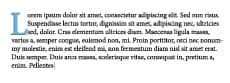
This plugin allows to display in a lightbox modal window the description field defined in Picture/Panorama Properties > Description, Group Properties > Description or Project Properties > Description. The Description Plugin is triggered by the [Plugin] Description.
 Watch on YouTube
 - How to Use the Description Plugin of Panotour Pro 2
- Introduction / Presentation
- Description Plugin Default Example
- Description Plugin Example 1: Position Top Center
- Description Plugin Example 2: Position Top Right
- Description Plugin Example 3: Offset
- Description Plugin Example 4: Display Current Group Description
- Description Plugin Example 5: Current Project Description
- Description Plugin Example 6: Border Radius
- Description Plugin Example 7: Border Margins
- Description Plugin Example 8: No Margins
- Description Plugin Example 9: Custom Background Color/Opacity
- Description Plugin Example 10: Use Group Colors
- Description Plugin Example 11: Display Description Title and Custom Font Style
- Description Plugin Example 12: Display Description Title and Custom Font Style 2
- Description Plugin Example 13: Specific Description Title
- Description Plugin Example 14: Examples of Overlay Colors
- Description Plugin Example 15: Description 35% Width
- Description Plugin Example 16: Description Fixed With and Height
- Description Plugin Example 17: Description 80% Width and Fixed Height
- Description Plugin Example 18: Display a Close Button
- Description Plugin Example 19: Close Description on Click
- Description Plugin Example 20: Use Animation
 Description can be triggered through actions, See also Description Action Set
To add a plugin from the plugin library to your project, double click on it
Multiple Instances: Yes
This plugin can be added in multiple instances on your tour. However, it is recommended not to add too much plugin instances that may be obtrusive for your visitor.
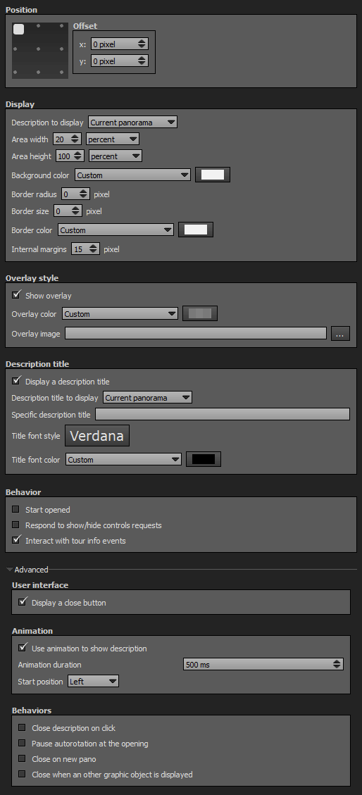
Position
- Square with dots: Sets the position you wish on your tour for the plugin. Available positions are top left, top right, middle right, bottom right, bottom left, middle left and center.
- Offset: Number of pixel that shifts the plugin from its default position. X values adjust horizontal offset and y values adjust vertical offset.
Display
- Description to Display: Drop-down menu to select which description you wish to use.
- Current Panorama: Gets the Picture/Panorama Properties > Description field of the current panorama in view.
- Current Group: Gets the Group Properties > Description field of the current panorama group.
- Current Project: Gets the Project Properties > Description field of the project.
- Use Group Color: Checkbox to use or not the color of the current group as background color for the description container. Note that this option is only available with «Current Group» description to display mode.
- Area Width: Width in pixels or % of the description container. Default value is 20%.
- Area Height: Height in pixels or % of the description container. Default value is 100%.
- Background Color: You can select the background color and opacity for the description container with the built-in color picker or select a project color in the drop-down menu. Project colors are defined in Project Properties > Color.
- Border Radius: Enter the number of pixels you wish for the border radius of the description container. Default value is 0 pixels.
- Border Size: Enter the number of pixels you wish for the border size.
- Border Color: You can select the border color and opacity for the description container border with the built-in color picker or select a project color in the drop-down menu. Project colors are defined in Project Properties > Color.
- Internal Margins: Enter the number of pixels of padding you wish between the edge of the description container and the content. Default value is 15 pixels.
Description Title
- Display a Description Title: Select which title to display
- Current Panorama: Displays the Name of the current Panoramas in view.
- Current Group: Displays the Name of the current Group.
- Current Project: Displays the Name of the Project.
- Specific Description Title: Enter a specific text that will always be displayed as title. Leave empty to let the dynamic description title display (default).
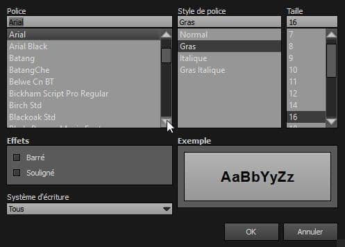
- Title Font Style: Click to open a window to customize font family, font size, font weight, font effect. Please see important notice about font style display.
- Title Font Color: You can select the font color and opacity with the built-in color picker or select a project color in the dropdown menu. Project colors are defined in Project Properties > Color.
Web Safe Font Families: Important Notice About Font Style
Please note that font you choose will may not display correctly on your users device. Font family you select has to be implemented on users computers/devices. Accordingly, prefer web safe font families like:
- Georgia, serif
- Palatino Linotype, Book Antiqua, Palatino, serif
- Times New Roman, Times, serif
- Arial, Helvetica, sans-serif (Recommended for readability and compatibility).
- Arial Black, Gadget, sans-serif
- Comic Sans MS, cursive, sans-serif
- Impact, Charcoal, sans-serif
- Lucida Sans Unicode, Lucida Grande, sans-serif
- Tahoma, Geneva, sans-serif
- Trebuchet MS, Helvetica, sans-serif
- Verdana, Geneva, sans-serif
- Courier New, Courier, monospace
- Lucida Console, Monaco, monospace
Overlay Style
- Show Overlay: Checkbox that displays a color layer between the description container and the tour.
- Overlay Color: You can select the overlay color and opacity with the built-in color picker or select a project color in the drop-down menu. Project foreground color is defined in Project Properties > Color
- Overlay Image: Add an image as background for the plugin.
- The image is scaled to be as large as possible so that the background area is completely covered by the background image.
- Some parts of the background image may not be in view within the background positioning area but the aspect ratio is preserved.
- Overlay image opacity is linked to the overlay color opacity.
Size
- Area Width: Sets area width in absolute (pixels) or relative (percentage) values. Default value is 20%.
- Area Height: Sets area height in absolute (pixels) or relative (percentage) values. Default value is 100%.
Behavior
- Start Opened: Makes the description open when the tour starts.
- Respond to show/hide controls request: Checkbox to make the plugin reactive to a show/hide request action triggered from itself or another plugin.
- Interact with Tour Info Events: Makes the description plugin reactive to the action «Show/Hide Tour Information» triggered by any plugin.
Advanced
- Display a Close Button: Checkbox to display a close button icon on your description container.
- Use Animation to Show Description: Checkbox to enable or disable the animation feature on the opening and closing of the description.
- Animation Duration: Enter the duration you wish the open/close animation lasts.
- Start Position: Drop-down menu to select where you wish to start the animation.
- Close Description on Click: Checkbox to close or not the description on user click.
- Pause Autorotation at the Opening: Checkbox to pause or not the autorotation when the description plugin is opened.
- Close on New Pano: Checkbox to close or not the description plugin when a new scene is called.
- Close when an Other Graphic Object is Displayed: Checkbox to enable or disable the closing of the description plugin when user opens an other graphic object.
Description can be triggered through actions, See also Description Action Set
The Description Plugin is always at the top of all others plugins. It will be always visible even if the plugin is at the lowest position order in Workspace. This HTML5 plugin is always displayed over the others plugins. You can order all plugins but this ordered HTML5 plugin will be always over the standard plugins. See more about Plugins Order
Title

This plugin allows to display the name field of the current picture/panorama defined in Picture/Panorama Properties > Name, but also the current group name defined in Group Properties > Name and the project name defined in Project Properties > Name.
Watch on YouTube - How to Use the Title Plugin of Panotour Pro 2
- Introduction / Presentation
- Title Plugin Default Example
- Title Plugin Example 1: Position Top Center
- Title Plugin Example 2: Position Top Right
- Title Plugin Example 3: Position Bottom Center
- Title Plugin Example 4: Offset
- Title Plugin Example 5: Display Current Group Title
- Title Plugin Example 6: Display Current Project Title
- Title Plugin Example 7: Custom Font Style and Color with No Text Shadow
- Title Plugin Example 8: Font Styles
To add a plugin from the plugin library to your project, double click on it
Multiple Instances: Yes
This plugin can be added in multiple instances on your tour. However, it is recommended not to add too much plugin instances that may be obtrusive for your visitor.
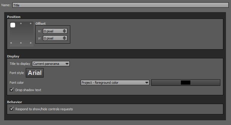
Position
- Square with dots: Sets the position you wish on your tour for the plugin. Available positions are top left, top center, top right, bottom right, bottom center, bottom left, middle left and center.
- Offset: Number of pixel that shifts the plugin from its default position. X values adjust horizontal offset and y values adjust vertical offset.
Display
- Title to Display: Drop-down menu to select which title you wish to display.
- Current Panorama: Gets the Picture/Panorama Properties > Name field of the current panorama in view.
- Current Group: Gets the Group Properties > Name field of the current panorama group.
- Current Project: Gets the Project Properties > Name field of the project.
- Font Style: Click to open a window to customize font family, font size, font weight, font effect. Please see important notice about font style display.
- Font Color: You can select the font color and opacity with the built-in color picker or select a project color in the dropdown menu. Project colors are defined in Project Properties > Color.
- Drop Shadow Text: Adds an shadow effect to the text.
Web Safe Font Families: Important Notice About Font Style
Please note that font you choose will may not display correctly on your users device. Font family you select has to be implemented on users computers/devices. Accordingly, prefer web safe font families like:
- Georgia, serif
- Palatino Linotype, Book Antiqua, Palatino, serif
- Times New Roman, Times, serif
- Arial, Helvetica, sans-serif (Recommended for readability and compatibility).
- Arial Black, Gadget, sans-serif
- Comic Sans MS, cursive, sans-serif
- Impact, Charcoal, sans-serif
- Lucida Sans Unicode, Lucida Grande, sans-serif
- Tahoma, Geneva, sans-serif
- Trebuchet MS, Helvetica, sans-serif
- Verdana, Geneva, sans-serif
- Courier New, Courier, monospace
- Lucida Console, Monaco, monospace
Behavior
- Respond to show/hide controls request: Checkbox to make the plugin reactive to a show/hide request action triggered from itself or another plugin.
- Is clickable: Allows you to add a set of actions where clicking on the title.
BACK TO: Documentation / Panotour Documentation