Panotour - Style - Plugins library - Maps
Contents
- 1 Compass
- 2 Floor Plan
- 3 Panotour Maps
- 3.1 Multiple Instances: No
- 3.2 Apart from the Virtual Tour Type of Display
- 3.3 Above the Virtual Tour Type of Display
- 4 Radar
 Compass
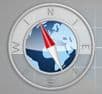
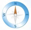
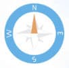
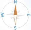
This plugin displays the compass on your tour to indicate the view direction.
 Watch on YouTube
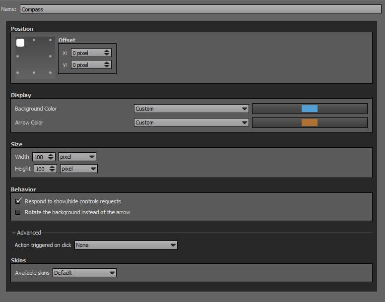
 To add a plugin from the plugin library to your project, double click on it
Multiple Instances: Yes
This plugin can be added in multiple instances on your tour. However, it is recommended not to add too much plugin instances that may be obtrusive for your visitor.
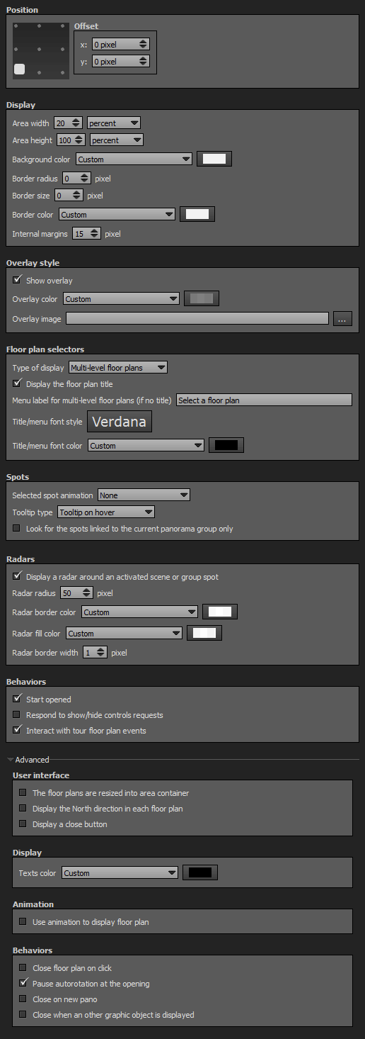
Position
- Square with dots: Sets the position you wish on your tour for the plugin. Available positions are top left, top center, top right, middle right, bottom right, bottom center, bottom left, middle left.
- Offset: Number of pixel that shifts the plugin from its default position. X values adjust horizontal offset and y values adjust vertical offset.
Display
- Background Color: You can select the plugin compass background color and opacity with the built-in color picker or select a project color in the dropdown menu. Project colors are defined in Project Properties > Color.
- Arrow Color: You can select the plugin compass arrow color and opacity with the built-in color picker or select a project color in the dropdown menu. Project colors are defined in Project Properties > Color.
Size
- Width: Sets the width in pixels or percentage of the compass. 100 pixels by default.
- Height: Sets the height in pixels or percentage of the compass. 100 pixels by default.
Behavior
- Respond to show/hide controls request: Checkbox to make the plugin reactive to a show/hide request action triggered from itself or another plugin.
- Rotate the Background instead of the Arrow: Checkbox to enable or disable the compass background rotation mode.
Advanced: Action Triggered on Click
- None: No action triggered on user click.
- Interact with Tour Map Events: Toggles show/hide the tour map on user click. This function requires PanotourMaps Plugin.
- Interact with Floor Plan Events: Toggles show/hide the floor plan on user click. This function requires Floor Plan Plugin.
Skins
«Default» Compass Skin (200 pixels max. width and height)
«100pixelsfull» Compass Skin (100 pixels max. width and height)
«100pixelslight» Compass Skin (100 pixels max. width and height)
«200pixelsfull» Compass Skin (200 pixels max. width and height)
«200pixelslight» Compass Skin (200 pixels max. width and height)

«250pixelsMulticolor» Compass Skin (250 pixels max. width and height)
«50pixelsfull» Compass Skin (50 pixels max. width and height)
«50pixelslight» Compass Skin (50 pixels max. width and height)
Important Notice about Skins
Skins get their own widths and heights that are in relation with the [[#Size|Size]] adjustments. If you adjust width and/or height with more pixels than the native skin resolution, you may get bad render of the compass.
If you select 200pixelsfull skin, do not exceed 200 pixels wide and height, for example.
Percentage sizes are not recommended for this plugin.
Floor Plan
This plugin displays the floor plan on your tour. The floor plan allows your visitors to easily and quickly know their current position in the tour and then make it more convenient to navigate through.
- The Floor Plan plugin is triggered by the [Plugin] Floor Plan Action.
- You can define multi-level floor plans with points of interest (see Floor Plan Hotspots).
- Remember you can add a floor plan for the project (Project Properties > Floor Plan) and for each group of pictures/panoramas (Group Properties > Floor Plan).
Floor Plan can be triggered through actions, See also Floor Plan Action Set
Watch on YouTube Live examples
To add a plugin from the plugin library to your project, double click on it
Multiple Instances: No
Only one instance of this plugin can be added to your tour.
Position
- Square with dots: Sets the position you wish on your tour for the plugin. Available positions are top left, top center, top right, middle right, bottom right, bottom center, bottom left, middle left and center.
- Offset: Number of pixel that shifts the plugin from its default position. X values adjust horizontal offset and y values adjust vertical offset.
Display
- Area Width: Sets the width of the floor plan container in percents or pixels. 20% is the default value.
- Area Height: Sets the height of the floor plan container in percents or pixels. 100% is the default value.
- Background Color: You can select the plugin background color and opacity with the built-in color picker or select a project color in the dropdown menu. Project colors are defined in Project Properties > Color.
- Border Radius: Sets the border radius of the floor plan container. 0 pixel is the default value.
- Border Size: Enter the size in pixels of the floor plan container border. Default value is 15px.
- Border Color: You can select the plugin container border color and opacity with the built-in color picker or select a project color in the dropdown menu. Project colors are defined in Project Properties > Color.
- Internal Margins: Sets the distance between the floor plan container limits and its content.
Overlay Style
- Show Overlay: Checkbox to enable or disable the overlay: An opacity adjustable colored layer between your plugin container and the tour.
- Overlay Color: You can select the overlay color and opacity with the built-in color picker or select a project color in the dropdown menu. Project colors are defined in Project Properties > Color.
- Overlay Image: Add an image as background for the plugin.
- The image is scaled to be as large as possible so that the background area is completely covered by the background image.
- Some parts of the background image may not be in view within the background positioning area but the aspect ratio is preserved.
- Overlay image opacity is linked to the overlay color opacity.
Floor Plan Selectors
- Type of Display
- Multi-Level Floor Plans: Displays the floor plan assigned to the current panorama and adds a dropdown selection menu with all the floor plans available in your tour.
- Single Floor Plan: Displays only the floor plan of the current group or project.
- Display the Floor Plan Title: Checkbox to display or not the floor plan title (Floor plan settings are set into Project Properties > Floor Plan and Group Properties > Floor Plan.
- Menu Label for Multi-Level Floor Plan: Enter text you wish to display by default on the dropdown menu. Available only when a «Multi-Level Floor Plan» type of display is selected and «Display the Floor Plan Title» is unchecked.
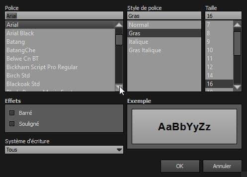
- Title/Menu Font Style: Click to open a window to customize font family, font size, font weight, font effect. Please see important notice about font style display.
- Title/Menu Font Color: You can select the font color and opacity with the built-in color picker or select a project color in the dropdown menu. Project colors are defined in Project Properties > Color.
Web Safe Font Families: Important Notice About Font Style
Please note that font you choose will may not display correctly on your users device. Font family you select has to be implemented on users computers/devices. Accordingly, prefer web safe font families like:
- Georgia, serif
- Palatino Linotype, Book Antiqua, Palatino, serif
- Times New Roman, Times, serif
- Arial, Helvetica, sans-serif (Recommended for readability and compatibility).
- Arial Black, Gadget, sans-serif
- Comic Sans MS, cursive, sans-serif
- Impact, Charcoal, sans-serif
- Lucida Sans Unicode, Lucida Grande, sans-serif
- Tahoma, Geneva, sans-serif
- Trebuchet MS, Helvetica, sans-serif
- Verdana, Geneva, sans-serif
- Courier New, Courier, monospace
- Lucida Console, Monaco, monospace
Spots
- Tooltip Type: Label Under the Spot: Displays tooltips under the hotspots of your floor plan.
- Tooltip Type: Label on Hover: Displays tooltips when user hovers the hotspots of your floor plan.
Radars
- Display a Radar around an Activated Scene or Group Spot: Checkbox to display a radar zone around the hotspot of the current scene. This works on scenes linked to floor plan hotspots based on the picture/panorama orientation.
- Radar Radius: Sets the radius of the radar in pixels: Default value is 10 pixels.
- Radar Border Color: You can select the radar border color and opacity with the built-in color picker or select a project color in the dropdown menu. Project colors are defined in Project Properties > Color.
- Radar Fill Color: You can select the radar fill color and opacity with the built-in color picker or select a project color in the dropdown menu. Project colors are defined in Project Properties > Color.
- Radar Border Width: Sets the border thickness in number of pixels. Default value is 1 pixel.
Behaviors
- Start Opened: Open the floor plan when the tour starts.
- Respond to show/hide controls request: Checkbox to make the plugin reactive to a show/hide request action triggered from itself or another plugin.
- Interact with Tour Floor Plan Events: Makes the floor plan reactive to the action «Show/Hide Floor Plan» triggered by any plugin.
Advanced: User Interface
- The Floor Plans are Resized into Area Container: Useful function to resize the floor plan according to its container size defined above in «Display > Area Size».
- Display the North Direction in Each Floor Plan: Displays an arrow with a «N» to define the North cardinal point on your floor plan.
- Display a Close Button: Displays a close button icon on your floor plan.
Advanced: Display
- Texts Color: You can select the floor plan texts color and opacity with the built-in color picker or select a project color in the dropdown menu. Project colors are defined in Project Properties > Color.
Advanced: Animation
- Use Animation to Display Floor Plan: Checkbox to enable or disable the animation feature on the opening and closing of the floor plan.
- Animation Duration: Enter the duration you wish the open/close animation lasts.
- Start Position: Dropdown menu to select where you wish to start the animation.
Advanced: Behaviors
- Close Floor Plan on Click: Checkbox to make the floor plan close when user clicks anywhere on the floor plan container excepting on hotspots.
- Pause Autorotation at the Opening: Checkbox to pause the autorotation when the floor plan is opened.
- Close on New Pano: The floor plan closes when a new picture/panorama is called and loaded.
- Close When an Other Graphic Object is Displayed: Checkbox to close the floor plan when a graphic object (Image, Video, Gallery, etc) is displayed.
Floor Plan can be triggered through actions, See also Floor Plan Action Set
This HTML5 plugin is always displayed over the others plugins. You can order all plugins but this ordered HTML5 plugin will be always over the standard plugins. See more about Plugins Order
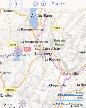
Panotour Maps
This plugin displays the map of your tour with points of interest.
- The PanotourMaps Plugin is triggered by the [Plugin] PanotourMaps Action.
- The PanotourMaps displays hotspots generated automtically in Pictures/Panoramas Properties > Geolocalisation and manually added point hotspots in the Web Map Hotspot Editor.
- This plugin behaves according to the type of display you set:
PanotourMaps can be triggered through actions, See also PanotourMaps Action Set
PanotourMaps communicates with external web applications, it requires an Internet connection to work properly, even in local mode.
Watch on YouTube Live examples
Multiple Instances: No
Only one instance of this plugin can be added to your tour.
Apart from the Virtual Tour Type of Display
The map is displayed into a frame in your tour.

To add a plugin from the plugin library to your project, double click on it
Position
- Square with dots: Sets the position you wish on your tour for the plugin. Available positions depend on the type of display you choose.
- Available positions: Top center, middle right, bottom center and middle left.
- Offset: Number of pixel that shifts the plugin from its default position. X values adjust horizontal offset and y values adjust vertical offset.
Display
Apart from the virtual tour
- Map Display Size: Sets the size ratio value in percents, based on browser size, of the PanotourMaps container. 30% is the default value.
- Resizable Map Zone: Checkbox to set or not the ability for the user to resize the map container area.
- Background Color: You can select the map background color and opacity with the built-in color picker or select a project color in the dropdown menu. Project colors are defined in Project Properties > Color.
Above the virtual tour
- Area Width: Sets the width of the map container in percents or pixels. 20% is the default value.
- Area Height: Sets the height of the map container in percents or pixels. 100% is the default value.
- Background Color: You can select the plugin background color and opacity with the built-in color picker or select a project color in the dropdown menu. Project colors are defined in Project Properties > Color.
- Border Radius: Sets the border radius of the map container. 0 pixel is the default value.
- Border Size: Enter the size in pixels of the map container border. Default value is 15px.
- Border Color: You can select the plugin container border color and opacity with the built-in color picker or select a project color in the dropdown menu. Project colors are defined in Project Properties > Color.
- Internal Margins: Sets the distance between the floor plan container limits and its content.
Layers
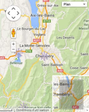
«Google Map» Provider for PanotourMaps
«Bing» Provider for PanotourMaps

«OpenStreetMap» Provider for PanotourMaps
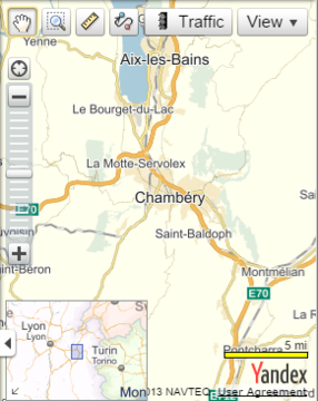
«Yandex» Provider for PanotourMaps
- Main Map Layer: You can choose between several maps providers like Google Maps, Bing Maps, OpenStreetMap and Yandex.
- Main Map Key:
- Google Maps: Requires a map key which is free. See how to get an API key for Google Maps here.
- Bing Maps: Requires a map key which is free. See how to get an API key for Bing Maps here.
- Yandex: Requires a map key which is free. See to create your Yandex API keys.
- You don't need a map key for OpenStreetMap.
- Map Type: You can choose between 4 types of maps display: Road, Satellite, Hybrid, Physical.
Spots
- Selected Spot Animation: Select whether or not to animate the selected spot on the map.
- None: No animation.
- Bouncing Animation
- Apply Animation only on Spots Linked to Scenes: When checked, the animation will be applied only on spots linked to a panorama scene or a group scene.
- Tooltip Type
- Info Box: Displays an info box over the map with a close button.
- Tooltip on Hover: Displays the tooltip when the user hovers the hotspot.
- Label Under Marker: Always display the tooltip under the hotspot. Note that this tooltip type may not work with Google Maps.
- Displays Info Box on Hover: Checkbox to display or not the info box when user hovers the spot.
 Panotour Pro 2 only Tooltips of automatic generated hotspots in Pictures/Panoramas Properties > Geolocalisation may not work if your spot style tooltip template is not set to «%p» in its Map Point Spot Style.
Radars
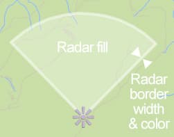
- Display a Radar around an Activated Scene or Group Spot: Checkbox to display a radar zone around the hotspot of the current scene. This works on scenes linked to floor plan hotspots based on the picture/panorama orientation.
- Radar Border Width: Sets the border thickness in number of pixels. Default value is 6 pixel.
- Radar Border Color: You can select the radar border color and opacity with the built-in color picker or select a project color in the dropdown menu. Project colors are defined in Project Properties > Color.
- Radar Fill Color: You can select the radar fill color and opacity with the built-in color picker or select a project color in the dropdown menu. Project colors are defined in Project Properties > Color.
- Radar Radius Linked to Zoom Level: Checkbox to control the behavior of the radar.
- When checked, radar radius is always in relation with the zoom level and then changes.
- When unchecked, radar radius is always the same and is defined in meters. Radar size changes according to zoom level.
- Radar Radius: Sets the number of meters you wish to apply to the radar radius. This setting is only available with «Radar Radius Linked to Zoom Level» unchecked.
Controls
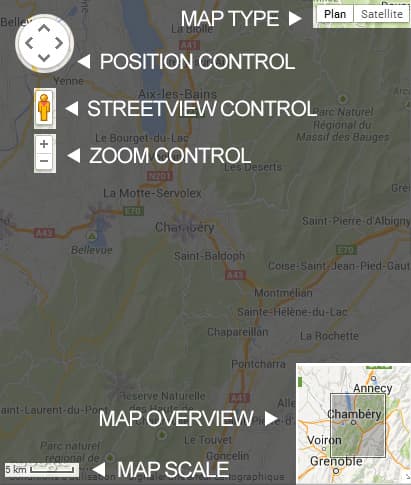
- Display a Zoom Control: Checkbox to display or not the plus and minus zoom buttons of the map provider.
- Display a Position Control: Checkbox to display or not the position buttons of the map provider.
- Display a Map Type Control: Checkbox to display or not a menu with all the map types available.
- Display the Map Scale: Checkbox to display or not the map scale of the map provider.
Behaviors
- Start Opened: Open the map when the tour starts.
- Respond to show/hide controls request: Checkbox to make the plugin reactive to a show/hide request action triggered from itself or another plugin.
- Interact with Tour Map Events: Makes the map reactive to the action «Show/Hide Map» triggered by any plugin.
- Center the Map to the Current Panorama or Group Spot: When checked, the map is automatically centered to the current scene or group.
Advanced: Multi-Maps (Apart from the tour display only)
- Add a Multimap Selector to Swap between Map Layers: Checkbox to allow or not the user to choose between map providers.
- Selector Label: Enter the label you wish to display for the map provider chooser menu.
- Main Map Label: Enter the label you wish to display for the main map layer.
- Second Map
- Second Map Layer: Choose your second map provider.
- Second Map Key:
- Google Maps: Requires a map key which is free. See how to get an API key for Google Maps here.
- Bing Maps: Requires a map key which is free. See how to get an API key for Bing Maps here.
- Yandex: Requires a map key which is free. See [the http://api.yandex.ru/maps/faq.xml#key_1 to create your Yandex API keys].
- You don't need a map key for OpenStreetMap.
- Second Map Label: Enter the label you wish to display for the second map layer.
- Third Map
- Third Map Layer: Choose your third map provider.
- Third Map Key:
- Google Maps: Requires a map key which is free. See how to get an API key for Google Maps here.
- Bing Maps: Requires a map key which is free. See how to get an API key for Bing Maps here.
- Yandex: Requires a map key which is free. See [the http://api.yandex.ru/maps/faq.xml#key_1 to create your Yandex API keys].
- You don't need a map key for OpenStreetMap.
- Third Map Label: Enter the label you wish to display for the third map layer.
Advanced: User Interface
- Map is Draggable: Checkbox to enable or disable the draggable behavior of your map.
- Activate Zoom on Mouse Wheel: Checkbox to enable or disable the zoom with your mouse wheel.
- Zoom on Double Click: Checkbox to enable or disable the «zoom in» function when user double clicks on the map.
- Close Button Tooltip: Enter the tooltip text you wish to display to close the map.
- Close Button Image: Select a custom image (*.jpg, *.gif, *.png) to replace the default close button icon.
Advanced: Controls Specific to Main Map Layer
- Display a Google StreetView Control: Checkbox to enable or disable the Google StreetView control on your map. Note that this option is only available with Google Map provider.
- Activate 45° Imagery on High Zoom Levels: Only for Google Maps in applicable zones. Check this option to display the 45° view when the user zooms to a sufficient zoom level.
- Display a Map Overview: Checkbox to enable or disable the display of a overview into your map. Displays your map in a larger view in a corner of your map. Note that this option is only available with Google Maps and OpenStreetMap.
PanotourMaps can be triggered through actions, See also PanotourMaps Action Set
This HTML5 plugin is always displayed over the others plugins. You can order all plugins but this ordered HTML5 plugin will be always over the standard plugins. See more about Plugins Order
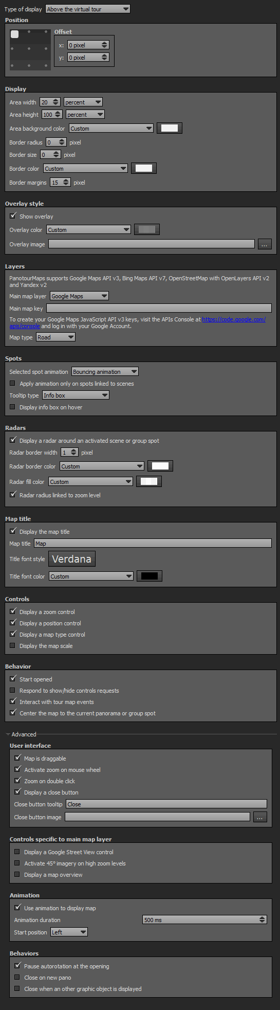
Above the Virtual Tour Type of Display
The map is displayed in a lightbox type modal window above your tour. You can add an overlay color with its own opacity.
To add a plugin from the plugin library to your project, double click on it
Position
- Square with dots: Sets the position you wish on your tour for the plugin. Available positions depend on the type of display you choose.
- Available positions: Top left, top center, top right, middle right, bottom right, bottom center, bottom left, middle left and center.
- Offset: Number of pixel that shifts the plugin from its default position. X values adjust horizontal offset and y values adjust vertical offset.
Display
- Area Width: Sets the width of the PanotourMaps container in percents or pixels. 20% is the default value.
- Area Height: Sets the height of the PanotourMaps container in percents or pixels. 100% is the default value.
- Area Background Color: You can select the plugin background color and opacity with the built-in color picker or select a project color in the dropdown menu. Project colors are defined in Project Properties > Color.
- Border Radius: Sets the border radius of the map container. 0 pixel is the default value.
- Border Size: Enter the size in pixels of the container border. Default value is 0px.
- Border Color: You can select the plugin container border color and opacity with the built-in color picker or select a project color in the dropdown menu. Project colors are defined in Project Properties > Color.
- Border Margins: Sets the distance in pixels between the map container limits and its content. Default value is 15px.
Overlay Style
- Show Overlay: Checkbox to enable or disable the overlay: An opacity adjustable colored layer between your plugin container and the tour.
- Overlay Color: You can select the overlay color and opacity with the built-in color picker or select a project color in the dropdown menu. Project colors are defined in Project Properties > Color.
- Overlay Image: Add an image as background for the plugin.
- The image is scaled to be as large as possible so that the background area is completely covered by the background image.
- Some parts of the background image may not be in view within the background positioning area but the aspect ratio is preserved.
- Overlay image opacity is linked to the overlay color opacity.
Layers
«Google Map» Provider for PanotourMaps
«Bing» Provider for PanotourMaps
«OpenStreetMap» Provider for PanotourMaps
«Yandex» Provider for PanotourMaps
- Main Map Layer: You can choose between several maps providers like Google Maps, Bing Maps and OpenStreetMap.
- Main Map Key:
- Google Maps: Requires a map key which is free. See how to get an API key for Google Maps here.
- Bing Maps: Requires a map key which is free. See how to get an API key for Bing Maps here.
- Yandex: Requires a map key which is free. See [the http://api.yandex.ru/maps/faq.xml#key_1 to create your Yandex API keys].
- You don't need a map key for OpenStreetMap.
- Map Type: You can choose between 4 types of maps display: Road, Satellite, Hybrid, Physical.
Spots
- Selected Spot Animation: Select whether or not to animate the selected spot on the map.
- None: No animation.
- Bouncing Animation
- Apply Animation only on Spots Linked to Scenes: When checked, the animation will be applied only on spots linked to a panorama scene or a group scene.
- Tooltip Type
- Info Box: Displays an info box over the map with a close button.
- Tooltip on Hover: Displays the tooltip when the user hovers the hotspot.
- Label Under Marker: Always display the tooltip under the hotspot. Note that this tooltip type may not work with Google Maps.
- Displays Info Box on Hover: Checkbox to display or not the info box when user hovers the spot.
Panotour Pro 2 only Tooltips of automatic generated hotspots in Pictures/Panoramas Properties > Geolocalisation may not work if your spot style tooltip template is not set to «%p» in its Map Point Spot Style.
Radars
- Display a Radar around an Activated Scene or Group Spot: Checkbox to display a radar zone around the hotspot of the current scene. This works on scenes linked to floor plan hotspots based on the picture/panorama orientation.
- Radar Border Width: Sets the border thickness in number of pixels. Default value is 6 pixel.
- Radar Border Color: You can select the radar border color and opacity with the built-in color picker or select a project color in the dropdown menu. Project colors are defined in Project Properties > Color.
- Radar Fill Color: You can select the radar fill color and opacity with the built-in color picker or select a project color in the dropdown menu. Project colors are defined in Project Properties > Color.
- Radar Radius Linked to Zoom Level: Checkbox to control the behavior of the radar.
- When checked, radar radius is always in relation with the zoom level and then changes.
- When unchecked, radar radius is always the same and is defined in meters. Radar size changes according to zoom level.
- Radar Radius: Sets the number of meters you wish to apply to the radar radius. This setting is only available with «Radar Radius Linked to Zoom Level» unchecked.
Map Title
- Display the Map Title: Checkbox to display or not the map title.
- Map Title: Enter the title you wish to display.
- Title Font Style: Click to open a window to customize font family, font size, font weight, font effect. Please see important notice about font style display.
- Title Font Color: You can select the font color and opacity with the built-in color picker or select a project color in the drop-down menu. Project colors are defined in Project Properties > Color.
Web Safe Font Families: Important Notice About Font Style
Please note that font you choose will may not display correctly on your users device. Font family you select has to be implemented on users computers/devices. Accordingly, prefer web safe font families like:
- Georgia, serif
- Palatino Linotype, Book Antiqua, Palatino, serif
- Times New Roman, Times, serif
- Arial, Helvetica, sans-serif (Recommended for readability and compatibility).
- Arial Black, Gadget, sans-serif
- Comic Sans MS, cursive, sans-serif
- Impact, Charcoal, sans-serif
- Lucida Sans Unicode, Lucida Grande, sans-serif
- Tahoma, Geneva, sans-serif
- Trebuchet MS, Helvetica, sans-serif
- Verdana, Geneva, sans-serif
- Courier New, Courier, monospace
- Lucida Console, Monaco, monospace
Controls
- Display a Zoom Control: Checkbox to display or not the plus and minus zoom buttons of the map provider.
- Display a Position Control: Checkbox to display or not the position buttons of the map provider.
- Display a Map Type Control: Checkbox to display or not a menu with all the map types available.
- Display the Map Scale: Checkbox to display or not the map scale of the map provider.
Behaviors
- Start Opened: Open the map when the tour starts.
- Respond to show/hide controls request: Checkbox to make the plugin reactive to a show/hide request action triggered from itself or another plugin.
- Interact with Tour Map Events: Makes the map reactive to the action «Show/Hide Map» triggered by any plugin.
- Center the Map to the Current Panorama or Group Spot: When checked, the map is automatically centered to the current scene or group.
Advanced: User Interface
- Map is Draggable: Checkbox to enable or disable the draggable behavior of your map.
- Activate Zoom on Mouse Wheel: Checkbox to enable or disable the zoom with your mouse wheel.
- Zoom on Double Click: Checkbox to enable or disable the «zoom in» function when user double clicks on the map.
- Display a Close Button: Checkbox to display or not a close button icon. Note that this function is not available with «Apart from the Virtual Tour» display type.
- Close Button Tooltip: Enter the tooltip text you wish to display to close the map.
- Close Button Image: Select a custom image (*.jpg, *.gif, *.png) to replace the default close button icon.
Advanced: Controls Specific to Main Map Layer
- Display a Google StreetView Control: Checkbox to enable or disable the Google StreetView control on your map. Note that this option is only available with Google Map provider.
- Activate 45° Imagery on High Zoom Levels: Only for Google Maps in applicable zones. Check this option to display the 45° view when the user zooms to a sufficient zoom level.
- Display a Map Overview: Checkbox to enable or disable the display of a overview into your map. Displays your map in a larger view in a corner of your map. Note that this option is only available with Google Maps and OpenStreetMap.
Advanced: Animation
- Use Animation to Display Map: Checkbox to enable or disable the animation feature on the opening and closing of the map.
- Animation Duration: Enter the duration you wish the open/close animation lasts.
- Start Position: Dropdown menu to select where you wish to start the animation.
Advanced: Behaviors
- Pause Autorotation at the Opening: Checkbox to pause or not the autorotation when user opens the map.
- Close on New Pano: Checkbox to close the map when a new picture/panorama is called and loaded.
- Close When an Other Graphic Object is Displayed: Checkbox to close the map when a graphic object (Image, Video, Gallery, etc) is displayed.
PanotourMaps can be triggered through actions, See also PanotourMaps Action Set
This HTML5 plugin is always displayed over the others plugins. You can order all plugins but this ordered HTML5 plugin will be always over the standard plugins. See more about Plugins Order
PanotourMaps communicates with external web applications, it requires an Internet connection to work properly, even in local mode.
Radar
This plugin displays a cone radar on your tour to indicate the field of view to the user.
To add a plugin from the plugin library to your project, double click on it
Multiple Instances: Yes
This plugin can be added in multiple instances on your tour. However, it is recommended not to add too much plugin instances that may be obtrusive for your visitor.
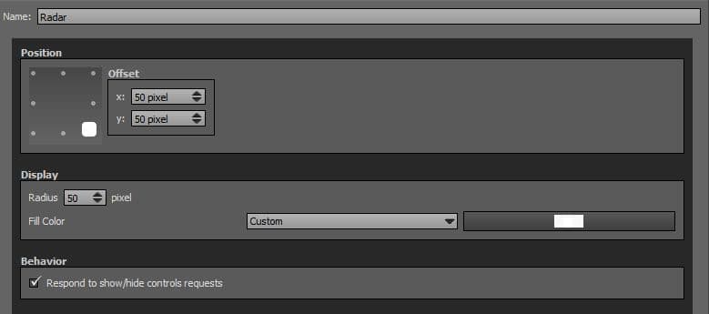
Position
- Square with dots: Sets the position you wish on your tour for the plugin. Available positions are top left, top center, top right, middle right, bottom right, bottom center, bottom left, middle left.
- Offset: Number of pixel that shifts the plugin from its default position. X values adjust horizontal offset and y values adjust vertical offset.
Display
- Radius: Sets the radar radius in pixels. Default value is 50 pixels.
- Fill Color: You can select the radar fill color and opacity with the built-in color picker or select a project color in the dropdown menu. Project colors are defined in Project Properties > Color.
Behavior
- Respond to show/hide controls request: Checkbox to make the plugin reactive to a show/hide request action triggered from itself or another plugin.